Topic: Reporting Services

Our state of the art Reporting Services solution provides an intuitive web interface for designing and amending reports. By implementing a cloud first, server only solution, we are increasing the scalability and making it easier to design and maintain reports with a simpler deployment.

Exploring
 Where it fits in?
Benefits
Where it fits in?
Benefits
-
Easier to design and maintain reports.
-
Simple deployment as a server only solution.
-
Intuitive interface for designing and amending reports.
The programs related to this feature are accessed from the Program List of the Syspro menu:
- Program List > Syspro Reporting Services
Terminology
Third-party reports
A third-party report in SYSPRO typically refers to a custom report or document that was developed by an external consultant, partner, or independent developer. These are reports that are not part of the standard reports that are included in the SYSPRO product.
Starting
Prerequisites
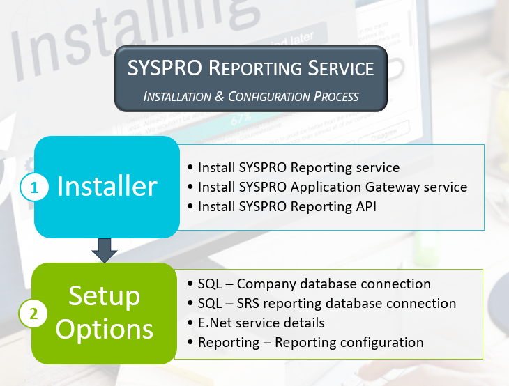
To use this feature, these components must be installed in the following order using the Syspro Installer Application:
-
Syspro Reporting Services
The Syspro Reporting Services engine requires the connection string containing the SQL Server, SQL user and password that is used to create reports. These are found in the SRS reporting database connection credentials.
This SQL user should be created and configured first before the Syspro Reporting Services engine is installed.
-
Syspro Application Gateway Service service
-
Syspro Reporting API
-
When installing theSyspro Application Gateway Service and Syspro Reporting API you are prompted to supply a valid gateway endpoint and authentication key before you can continue installing Syspro 8 2025.
-
The Syspro Reporting API communicates with the Syspro 8 e.NET Communications Load Balancer service via the WsHttp end point, which is displayed in the Syspro 8 e.NET Communications Load Balancer config file:
When the Syspro 8 e.NET Communications Load Balancer service is installed you have to specify the WsHttp endpoint. You can obtain that address from the service's config file that is located in the Program files/SYSPRO/SYSPRO 8 e.net Communications Load Balancer folder and should look similar to the following:
add key="portWsHttp" value="31004"
-
The Syspro Reporting API and the services required to run it can be located on different machines.
-
-
Syspro Reporting Server version 8.0.298 or higher
To use this feature, the following setup option(s) must be enabled/defined:
SQL System Setup
Setup Options > System Setup > SQL
-
Company database connection
-
Company database authentication
-
SQL Server name
-
-
SQL Server administrative information
-
Administrator login
-
Administrator login password
-
-
-
Standard login
-
Standard login password
The administrative and standard SQL user must have access to create a database and tables within the database, as well as access to read and write data.
-
-
SRS reporting database connection
-
The SRS reporting database connection is the SQL user that must have DBcreator and read/write access.
This is the user that creates the _SRS table the first time a report is generated and the user that obtains the data from the _SRS database.
-
The SRS reporting database connection is strictly used for the data that reports will use and will not be consumed by the Syspro Reporting API or the Syspro Reporting Services.
-
SRS authentication
-
SRS SQL Server name
-
SRS login
-
SRS login password
Select Test SQL connection to verify that the connection to the Syspro Reporting Services database is successful.
-
E.Net Service Details
Setup Options > System Setup > E.Net Service Details
-
Server name
-
SOAP port
-
REST port
Reporting
Setup Options > System Setup > Reporting
-
Reporting service API endpoint
The endpoint is created automatically by the Syspro Application Gateway Service service.
-
Maximum rows per report
Connectivity
Setup Options > System Setup > Connectivity
-
Application Gateway service settings
-
Use Application Gateway service
-
Application Gateway service endpoint
-
Authentication key
Select Test connection to verify that the connection to the Syspro Application Gateway Service is successful.
-
Licensing
To use this feature, the following module(s) must be installed according to the terms of your software license agreement:
-
Syspro Reporting Services
Security
You can secure this feature by implementing a range of controls against the affected programs. Although not all these controls are applicable to each feature, they include the following:
- You restrict operator access to activities within a program using the Operator Maintenance program.
- You can restrict operator access to the fields within a program (configured using the Operator Maintenance program).
- You can restrict operator access to functions within a program using passwords (configured using the Password Definition program). When defined, the password must be entered before you can access the function.
- You can restrict access to the eSignature transactions within a program at operator, group, role or company level (configured using the Electronic Signature Configuration Setup program). Electronic Signatures provide security access, transaction logging and event triggering that gives you greater control over your system changes.
- You can restrict operator access to programs by assigning them to groups and applying access control against the group (configured using the Operator Groups program).
- You can restrict operator access to programs by assigning them to roles and applying access control against the role (configured using the Role Management program).
Restrictions and Limits
-
Batch preview is not supported when printing a batch of documents, as this would open multiple preview panes.
Solving
Error messages
Output limit of 500 000 rows exceeded
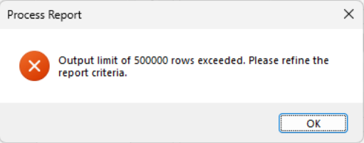
Cause
A default limitation of 500 000 line items was implemented to address the inconsistency in processing large reports with extensive data, which previously resulted in unpredictable behavior.
Solution
The limit can be configured at the Maximum rows per report setup option (Setup Options > System Setup > Legacy Reporting).
 Informational messages
This format is linked to an SRS document with a legacy template
Informational messages
This format is linked to an SRS document with a legacy template
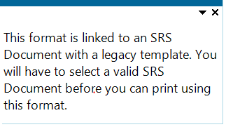
Cause
This message is displayed if you attempt printing a document that is linked to a legacy template.
Solution
Link the document to a template supported by the Syspro Reporting Services engine using the Maintain SRS Document Templates program.
FAQs
What's changed in Syspro 8 2025?
What has changed for Syspro Reporting Services in Syspro 8 2025?
The SYSPRO SRS What's changed in SYSPRO 8 2025 document outlines the changes made to Syspro Reporting Services in Syspro 8 2025.
Creating and scheduling reports
Can all operators create reports?
Permission to create a new SRS report is determined by the Report designer setup option against the operator.
You can give an operator permission to design new SRS reports by following these steps:
-
Access the Operator Maintenance program and select the operator.
-
Select the Options tab and navigate to the Access section.
-
Enable the Report designer option.
How can I create a new report in Syspro Web UI (Avanti) or on Syspro Desktop?
You can create a new report in Syspro Web UI (Avanti) or Syspro Desktop.
To create a new report in Syspro Desktop follow the below steps
-
Open Syspro Reporting Services (Program List > Syspro Reporting Services).
-
Select the File option at the top of the page.
-
Select New SRS Report and follow the steps seen in section 3 below, to create your report.
To create a new report in Syspro Web UI (Avanti) follow the below steps:
-
Select the hamburger menu icon to the top left of the page.
-
Within the hamburger menu navigate to Reporting Services > Setup > New Report.
A New Report popup will be displayed.
-
Under Action select, Create new report.
-
Under Report Type or Report based on select your preferred option between:
- Standard(Business Object in Desktop)
This refers to reports that are included by default in the SYSPRO package, for example the Credit Management or the Inventory Journal Report . These reports are based off business objects using the predefined schema as a dataset.
-
Custom Datasource
This refers to reports created using a data source from any of the supported data sources, for example SQL, Excel, Oracle.
-
GL Financial Report
This refers to a report previously created using the program GL Define Financial Reports. You can use Syspro Reporting Services to convert such a report into a more flexible and dynamic format.
- Standard(Business Object in Desktop)
-
Once you’ve finished entering your requirements and details for the report, select Save.
The Report Designer will automatically be displayed.
How do I connect to a datasource before generating a data set?
When creating a report, you will need to connect to a valid data source before generating a dataset into the Report Designer canvas. Doing so, is important when creating reports from a Custom Datasource.
Follow these steps to generate a dataset:
1. Connecting to the database and adding a data set:
-
Select the Data panel icon (found to the right of the Properties icon).
You’ll automatically be connected to the database that you are logged into. Your connection will be displayed under Data Sources.
-
Select the +Add button under Data Sets and choose your data from the options provided.
2. An Edit Data Set popup will be displayed.
-
Add the query that will be used to interrogate your data, to the Query section.
For example:
An example of a query to select data from a BAQ:
“select * from your_baqs_name” -
Select Validate, followed by OK.
The selected data set will be displayed under Data Sets .
3. Adding Data to the Canvas.
-
Select a format to add the data (such as a table), which can be selected from the Control Box on the left and dragged into the canvas.
Select an area of the table to add a field from your dataset to the selected area.
-
Alternatively you can select the data directly from the Data Sets section on the right side of the canvas.
Select the Select Fields icon found to the right of the data set. This will convert every field in your data set to a checkbox item.
-
Once you’ve checked your intended fields, drag your dataset into the canvas.
A table will be generated displaying your selected fields.
-
Select Save and Preview to view your report.
Can I select report parameters when using the Report Scheduler?
Yes, you can select report parameters by following these steps:
-
Launch the Report Scheduler program.
-
Select an existing schedule or create a new schedule.
-
Add the report in the Reports to Run listview.
-
Select the Define Options hyperlink to select what you want to include in the report at the Report options tab and how you want the report to be generated at the Output options tab.
If no options are selected, then the report is generated using the default options.
Working with data in the Report Designer
What are the main sections of the Report Designer?
-
On the left of the page, you’ll see a Control Toolbox which can be used to add various items including textboxes, images and tables.
-
In the center of the page is the Canvas, where your data can be placed and updated.
-
On the right-hand side of the page is the Properties section, which includes Advanced Properties where the layout, preview settings and data can be edited.
How can I edit and update the data in the Report Designer?
Once you've generated a dataset into the Report Designer there are many methods to edit and update it.
-
To add details or input to your data, select a field in the canvas and update it as required.
-
You can change the font size, put in bold, adjust the alignment, save or preview your work, using the toolbar at the top of the page.
-
To move columns in a table, select a column and drag it to the intended location
-
You can further format your data using the Properties tab. Select the fields in your canvas that you wish to format before selecting the Properties tab. Using the Properties tab you can edit your table’s borders, background, and features of your selected text.
What's the difference between a parameter and a filter?
-
Parameters define rules and criteria for selecting specific data. For instance, a parameter might specify that data related to a particular type of customer will be selected from a dataset.
-
Filters apply the rules of parameter to a selected destination.
How do I use the Expression Editor to learn about functions?
You can search any function in the expression editor and the syntax or formula will be displayed, as well as a brief description of the function.
For example:
Syntax: Max(<Values>)
Description: Returns the maximum non-null value from the specified expression.
Follow these steps to use the Expression Editor:
-
With the Report Designer open, select a field in the canvas where you intend to use a function.
-
Navigate to the Properties tab on the right of the page.
-
Under Common select the data binding button (displayed as a gray square to the right of the Value field).
-
The Expression Editor will be displayed.
Select the Search field and enter the name of the function you intend to use.
The function's syntax and description will be displayed.
-
Double-click your intended function displayed under Functions.
-
Enter the required data into the fields displayed under Expression.
-
Select Save and Preview your report.
How do I use the lookup function?
The lookup function in SYSPRO requires a field from your source and a field from your destination to match the two. Lookups are useful for transferring data from one dataset, to be displayed in another.
Follow these steps to use the lookup function:
1. With the Report Designer open, select a field in the canvas where you intend to perform the lookup.
2. Navigate to the Properties tab on the right of the page.
3. Under Common select the data binding button (displayed as a gray square to the right of the Value field).
4. The Expression Editor will be displayed. Select the Search field and enter lookup. The lookup function's syntax and description will be displayed.
5. Double-click the Lookup button displayed under Functions. The lookup function will be displayed under Expression.
6. Enter your intended data into the fields displayed under Expression.
7. Select Save and Preview your report.
How can I add a custom form field to a report?
-
Right-click on the report in the Program List and select Design Report.
The Report Designer will be displayed.
This option only applies to Syspro Desktop and will be visible if your operator is set up to be a report designer.
In Syspro Desktop this feature is found on the Report Form, using the gear on the top right corner.
-
Select the ReportBody tab to change the information in the body of the report.
-
Add a secondary data source to the report:
-
Select Data to display the data panel and view the data sets and available fields.
-
If the required data set is not displayed, select Add in the Data panel and select the data source to be used for the new dataset.
The Edit Data Set widow is displayed.
-
Add a name for the data set in the Name field of the General section.
-
Enter the query statement in the Query field.
-
Select Validate to validate the query statement.
-
Select OK.
The custom form fields will be displayed in the Data panel below the data set.
-
-
If a secondary data set is used, you must use a lookup function to link the secondary data set.
-
Select Properties gear to view the Textbox panel.
-
At the Value field select the Data Binding option and then select the Expression editor.
The Common - Value window is displayed.
-
Select the Lookup function from the Functions drop-down.
The function will be displayed in the Expression box.
-
-
Save your changes.
Data sources are automatically created for all companies in the SysproAdmin table.
How do I group data?
Grouping data refers to creating hierarchies within your selected information.
For example:
You may wish to create a view of your business’ branches, customers per branch, and the sales value per customer. In this case, you would group your data by branch, then by customer, then by sales values.
To group your data:
-
With the Report Designer open, select the field in your canvas that you wish to use as your data heading (grouping) and select the Data panel to the right of the canvas.
-
A handle titled Groups will be displayed. This handle can be used to manage the hierarchy of your groupings.
-
Select the field you intend to group your data with, from your data set.
Drag the field into the handle, to group the data within your table. Doing so will automatically create a group heading and group footer.
-
Select Save and Preview your report.
The group heading row can be used to insert titles for each field per grouping, while the footer row can be used to create totals for each column.
When adding a field to the group footer, the field will automatically aggregate the total value of the field in the grouping. For example, if a “sales value” field is added to the footer, the sum of the sales value for that grouping will automatically be displayed.
How do I create a nested table?
A nested table is a table within a table. Nested tables can be used to transport entire tables or grids from one dataset to another.
With the Report Designer open, ensure that both the table you wish to nest and the table that will contain the nested data are displayed on the canvas.
Follow these steps to create a nested table:
-
Select the table you wish to nest.
-
Drag the selected table into a field (or several merged fields) of the table you intend to nest it in.
-
Filter the nested table's data:
-
Select the cells of the nested table before navigating to the Properties tab to the right of the canvas.
-
Navigate to the Filters field under Data and select +Add....
-
The Filters section will be displayed.
Select the + Add... button to create a filter.
-
Add the criterion to ensure it filters the required data from your intended data-source into your nested table.
-
-
Save and Preview your report.
How can I use layers to create a watermark?
Watermarks can be created in SYSPRO without using layers.
1. Follow these steps to create layers within your report:
-
Launch the Report Designer and select the Report Toolbox bar on the left of the page.
-
Select the Layers function.
By default, there is only one layer per page.
Optional: For ease of use, select the “Hide Layer” icon to hide the default layer while adding the watermark.
-
Select the + Add Layer button to create Layer1.
Using layers you can select which Target Device or type of report the layer will be displayed on or left off.
With the Layer selected, navigate to the Layer tab under Properties. Under Target Device you can toggle the option to display the selected layer when previewed on Screen, used as an Export or when printed on Paper.
2. Follow these steps to create a watermark on your report:
-
With Layer1 selected, add the item that will contain your watermark to the canvas.
This container could be an image, textbox, or any option of your choice.
-
Select the container and navigate to the tab (the tab name depends on the selected container, e.g. Textbox if you have selected a textbox container) under Properties.
-
Select Layer1 under Layer Name of the Layout section.
-
To push your watermark to be displayed behind the contents of your report, select the Z-index under Layout and update the value to 0.
-
Select the container in the canvas and add your intended watermark or message.
-
Resize and center the container to ensure it displays as required in your report.
-
Unhide your default layer.
-
Save and Preview your report and ensure your watermark displays as intended.
How do I create a drilled through report?
Drilling through refers to a report, in which each linked section leads to a separate child report, that does not necessarily maintain the format of the initial report (the parent report).
Follow these steps to use the jump-to feature to create a drilled through report:
1. Using the Jump-to functionality.
-
Launch the Report Designer .
-
Select the item in the canvas (your intended section of a plot, table, graph etc.) and navigate to the Properties. Under Properties, the Plot tab will be displayed.
-
Under the Action section of Plot, select the Type field and choose what type of destination you intend for your report to lead to.
The options available in the drop-down:
-
Jump to Report
-
Jump to Bookmark
-
Jump to URL.
-
-
Depending on your selection, a new field will be displayed under Type. Select the exact destination you wish your report to link to, such as a specific URL, report, or bookmark.
-
You can add a parameter to parse your data into the linked report.
Select the + Add button displayed in the Parameters field in the Action section, before adding the details of the parameter.
-
Save the report.
2. Creating a filter for the child report.
To ensure that the jump-to reflects the section of the data that you intend, you may need to add a corresponding filter to the child report.
-
Open the child report and display it in the Report Designer.
-
Navigate to the Data tab and select Add + under Parameters.
-
Select the newly created parameter and enter your intended details.
-
Select the entire table or the portion you wish to filter before selecting the Properties tab to the right of the canvas.
-
Under Tablix the Data tab will be displayed. Select + Add... next to the Filters field.
-
Add the details to the filter.
-
Save the report.
3. Using the drilled through report.
-
Navigate back to the parent report.
-
Select the Preview icon and test the functionality of the jump-to features you've added.
Printing, importing and exporting reports and report templates
Can I import report templates?
Yes, you can import report templates in one of the following ways:
-
Launch the SRS Document Templates Import program and select the Import function.
-
Use the Import function that is displayed on the toolbar of the SRS Document Templates Maintenance program.
The SRS Document Templates Import program will be displayed.
-
Access to the Import function can be restricted by applying access control against groups or roles.
-
Template files with an rdlx extension can be imported using one of the programs mentioned above.
-
If a report has been exported from Syspro Reporting Services, using the Export function, the files will reside in a zip file which can then be imported using the Import function. Doing so, will import the template as well as a corresponding control file and form.
Can I export report templates?
Yes, you can export report templates in one of the following ways:
-
Launch the SRS Document Templates Export program and select the Export function.
-
Use the Export function that is displayed on the toolbar of the SRS Document Templates Maintenance program.
The SRS Document Templates Export program will be displayed.
-
Access to the Export function can be restricted by applying access control against groups or roles.
-
If a report has been exported from Syspro Reporting Services, using the Export function, the files will reside in a zip file which can then be imported using the Import function. Doing so, will import the template as well as a corresponding control file and form.
How do I export a report from the SRS Viewer?
-
With the SRS Viewer open and displaying the report you wish to export, select the Export icon.
The Export tab will be displayed to you.
When exporting a report from the SRS Viewer, you’ll be able to use the Advanced Settings of the export function.
Select the Advanced Settings checkbox under the Export tab to view the full package of export features and options.
-
Select your intended format (such as PDF) and any other options of your choice before selecting the Export button.
Doing so, will create your report and send it to the downloads folder of your device.
How do I export a report directly from Syspro Reporting Services?
With Syspro Reporting Services open:
-
Select the report you wish to export from Available Reports.
-
In the pop-up window, select the Export Report checkbox.
Next to the checkbox is the Export Options button.
The options available in Export Options are not as extensive as those available when previewing a report in the SYSPRO Viewer.
-
Select the Process button, once you’ve finalized your selections.
How do I send a report to the queue?
Printing directly can be a time-consuming process. To save time, you can send your report to the queue to be printed, which enables you to keep working in SYSPRO while your report is printed in the background.
To send a report to the queue using Syspro Desktop, follow the below steps:
With Syspro Reporting Servicesopen:
-
Select the report you wish to print from Available Reports.
-
Select the Output Options tab before deselecting Preview Report.
-
After deselecting Preview Report select Process.
Doing so will send the report to the queue.
-
To view the report in the queue navigate to SYSPRO before selecting the Report Queue icon.
To send a report to the queue using Syspro Web UI (Avanti) follow the below steps:
-
Select your intended report either through a tile or through the hamburger menu.
-
Select the Add to Queue icon.
-
To view the report in the queue navigate to SYSPRO before selecting the Report Queue icon.
Where are the printing jobs for the Syspro Reporting Services saved?
The information is saved in the Jobs and ScheduledJobs tables within the SysproReportingService database.
Using
Process
Installation and Configuration
-
Install the Syspro Reporting Services engine.
-
Install the SYSPRO menu Server 8.00.298
-
Review the following product parameters:
-
SQL Server connection string
For example:
Data Source=SQLSERVER;User ID=user;Password=password;TrustServerCertifiate=False;
Replace SQLSERVER with the SQL server name used for reporting, user with the username of the SQL Server user and password with the SQL server user password.
-
Installation directory
-
-
-
Install the Syspro Application Gateway Service service.
Parameters of the Syspro Application Gateway Service
Parameter Description and considerations HTTP Port
Indicate if you want to use an HTTP port.
Default port number provided: 30800
Accept the default provided or change manually to match your preference.
Add HTTP port to firewall
For best practice, enable this option to ensure that the port number is added to your firewall.
HTTPS Port
Indicate if you want to use an HTTPS port.
Default port number provided: 30801
Accept the default provided or change manually to match your preference.
SSL certificate details are required when selecting this port type.
Add HTTPS port to firewall
For best practice, enable this option to ensure that the port number is added to your firewall.
Certificate Store
This indicates the SSL certificate store found against your system.
This field is read only and can't be changed.
Certificate Subject
Select the Browse icon to retrieve the relevant SSL certificate to use for running your web client.
This launches the Parameter Certificate Browser screen with the valid and current SSL certificates available under the default stores.
The selection defaults to the first item found in the Store list which subsequently loads the Subjects (also defaulting to the first item in the list).
From here you can browse for and select the applicable SSL certificate.
Certificate Subject Overwrite
This indicates the current SSL certificate subject, if the Overwrite Subject option was enabled within the Parameter Certificate Browser screen.
This field is read only and can't be changed.
Please enter the SYSPRO Gateway Read Only Authentication key
Enter a read-only authentication key for the Syspro Application Gateway Service service.
For example:
AppGateWayPass123
You can define any password, pass-phrase or secret for this authentication key, and once defined its stored in the Gateway’s configuration as a hashed value.
Ensure that you take note of this key as it is required later when configuring the gateway in the Setup Options program.
Please enter the SYSPRO Gateway Authentication key
Enter a value for the Syspro Application Gateway Service authentication key.
For example:
AppGatewayKey321
You can define any password, pass-phrase or secret for this authentication key, and once defined its stored in the Gateway’s configuration as a hashed value.
If you plan on installing the Syspro Embedded Analytics module:
Ensure that you take note of this key as it will be required during the install for , as well as within the Setup Options program when configuring your environment.
Destination Folder
Default provided: C:\Program Files\SYSPRO\SYSPRO Application Gateway
Accept the default provided or change manually to match your preference.
-
Install the Syspro Reporting API service.
Affected programs
The following indicates areas in the product that may be affected by implementing this feature:
Setup programs
SRS Document Templates Maintenance
Program List > SRS Documents > Document Setup
This program lets you maintain document templates that can be linked to document types.
Maintain SRS Document Templates
Program List > SRS Documents > Document Setup
This program lets you create and maintain documents and link these to document templates.
For the Reporting Services engine, we made the following changes in this program:
-
You can import and export documents, as well as maintain document templates by selecting the Functions option from the toolbar.
-
You can specify the output folder where you want to store printed documents by selecting the Configure hyperlink at the Output options field.
-
You can view the template used, schema and sample XML by selecting the View hyperlink at the Document details field.
-
You can view the operator, date and time details by selecting the View hyperlink at the History field.
Report programs
For the Reporting Services engine, we made the following changes:
-
All reports have been updated and converted for the new Syspro Reporting Services engine.
-
Various 'List of' reports have been deprecated, as these can be easily created.In most cases the information contained in these reports can simply be exported from the listview containing the data. You can view the list of programs deprecated in Syspro 8 2025.
Import programs
SRS Document Templates Import
Program List > SRS Documents > Document Setup
This program lets you import SYSPRO Reporting Services document templates per document type.
Export programs
SRS Document Templates Export
Program List > SRS Documents > Document Setup
This program lets you export SYSPRO Reporting Services document templates per document type.
Query programs
SRS Report Queue
Syspro Ribbon bar > Home
This program lets you manage, execute (i.e. print, email, export) and schedule all your reports on the server.
For the Reporting Services engine, we made the following changes in this program:
-
We added the Type field to the toolbar, where you can select to view either documents and reports in the queue.
-
We added the Purge Manager option to the toolbar.
-
We added the Additional filters option that lets you filter by document types, dates, times and status.
-
The Preview hyperlink lets you preview reports and documents.
-
We removed the Show scheduled reports option as all reports will be displayed in the listview as per the selections.
-
Listviews refresh automatically as you select options.
SRS Documents Preview
Accessible from the Preview function in various programs that generate documentation, e.g. the Sales Order Entry program.
This program lets you preview documents generated online using the Reporting Services engine and all documents and reports from the SRS Report Queue program.
Scheduling programs
Report Scheduler
Program List > Syspro Reporting Services
This program provides the functionality to automate the generation and distribution of reports at predefined intervals.
Browse programs
SRS Document Queue
Syspro Programs > SRS Documents > Document Setup
You use this program to view, execute and manage all documents (e.g. invoices, statements, quotations, etc.) in the document queue, when using server-side printing.
For the Reporting Services engine, we made the following changes in this program:
-
We removed the Purge Manager option from the toolbar, as this functionality is now located within the SRS Report Queue program.
Using the Report Designer
The Report Designer provides an easy-to-use interface that allows users without prior reporting experience to design engaging and interactive reports. The Report Designer provides you with the ability to create a new report or edit an existing one without writing any code. The designed reports can then be exported to any format or printed from the preview window. The main interface elements of the Report Designer are the Report Toolbox, Menu Bar, Properties, Data Panels, and a Design Area (Canvas).
Report Designer
Report Toolbox
The Report Toolbox contains the Report Explorer, Group Editor and Report Controls that assist in designing reports.
-
Report Explorer
Provides an overview of the hierarchy of added report items. It displays the current selection and allows the selection of other report items.
-
Group Editor
Shows column and row hierarchies of tablix members for currently selected tablix or table data region.
-
Layers
Used to add layers to the report. Use the + Add Layer button to add new layers. A default layer is automatically present in the designer.
-
Report Controls
Includes all the available controls for designing a report, such as textbox, checkbox, container, line, shape, table of contents, image, list, table, tablix, chart, bullet, barcode, etc.
Menu Bar
The Menu Bar contains options to undo or redo an action as well as to save, preview and format a report.
Properties and Data Panels
Access and modify the properties of a report or manage data connection using these panels.
-
Properties
Displays the properties of the selected report control in the Design Area. If more than one control is selected, the panel displays their common properties. Use the Collapse/Expand toggle button to view the collections on the Property panel. If you open any collection on the Property panel for one item, then it will remain open even if you switch to another item and it will collapse for all when you click the collapse option.
-
Data:
Contains options to add datasets, parameters, and common values.
-
Data sets
Displays the datasets available for designing a report.
-
Parameters
Allows you to add and modify report parameters.
-
Common Values
Displays common values such as current date and time, page number, total pages, page N of M, report name, user ID, and user language, to use in your reports.
-
Design Area
The Design Area allows you to create and edit reports by simply dragging and dropping the report controls from the Report Toolbox into the Design Area.
Other Settings
The Set Zoom percentage allows you to switch between advanced or basic property mode, specify grid settings and more.
-
Grid
Show or hide grid lines in the Design Area.
-
Snap
Enable or disable report controls to snap to grids and guides when you drag them into the Design Area. You can also specify the size of the grid lines.
-
Zoom
Set the zoom percentage of the Design Area by clicking the zoom-in and zoom-out buttons.
-
Grid Unit
Switch to the measurement unit for the grid lines to centimeters. By default the grid unit is set to inches.
-
Properties Mode
Switch to advanced or basic properties mode. By default basic properties mode is selected.
Data Binding in ReportsUsing New Based on Server Data Source
If you want to fetch data from a data source to be used only in one report and to configure its related data options such as fields, parameters and filters to display only the required information.
With the Report Designer open:
-
Go to the Data panel and click Dataset > Add.
-
Select the datasource from the list of SYSPRO company Databases and click Add.
-
In the Edit Data Set dialog that appears, provide the Query field, and other settings for the chosen dataset as shown in the next steps.
-
Enter your intended name of the dataset in the Name field. By default, this field is set to Dataset1. The dataset name should not contain any empty spaces or special characters such ("-", "/", "@", etc).
-
In the Query field, write a SQL query to extract the data from the data source. (eg. Select * from ExampleData)
-
Click the Validate button to verify the SQL statement.
If the SQL query is successfully validated, you will see a count of queried fields against the Bound Fields field. Click the Show Items button to view the entire list of bound fields in the dataset. Field names are the names given to the fields in a dataset, while the data fields are the original names of the fields in the database, which should not be modified or renamed.
-
-
By default field names show the same names as the data fields. You can modify a field name by replacing its old name with the new name. To delete a field click the Delete icon adjacent to the field name in the list. Deleting a field here will not affect the actual data stored in the data source.
-
Add a calculated field in the dataset to create a new field by applying some calculations to the existing data. You can add a calculated field using the Add button.
-
In the Parameters field, you can add report parameters and then use the "where" clause in the SQL query to filter the data.
-
To display only relevant data in the report use filtering in the dataset. The Filters field is especially useful when you have a data source like XML that does not support query parameters.
-
Click the Validate button to verify the dataset definition, and then the OK button. The dataset will be added to the report.
Managing a Dataset in a Report
Under the Data panel there are two icons displayed next to each dataset. Select the Edit icon to modify the existing details for a dataset by changing its name, parameter value(s), field name(s), filter value(s), and so on. The Delete icon can be used to remove the bound dataset from the report.
Report Controls
The Report Toolbox in the Report Designer offers several report controls and data regions that you can use to create a report. You can drag these from the Report Toolbox and drop them onto your reports. Each report control in the Report Toolbox has its own sets of predefined settings which you can customize as per your requirements.
The following table lists the available report controls in the Report Toolbox.
Table of Report Controls
| Report Control | Description |
|---|---|
| TextBox | The textbox control is the most extensively used report control by the users. It is used to display static text and expressions in a report. In addition, it is the default control that appears in each cell of a table or tablix report control and is automatically created when you drag a field from a dataset onto the design area. |
| CheckBox | The checkbox control is used to display boolean data, which can have one of the two possible values: true or false. You can check and clear a checkbox by simply clicking on it. By default, a checkbox control appears as a small box with its text to the right. |
| Container | The container control is used as a container for other report items. Use this report control to enhance the layout and appearance of your report. There is no data associated with the Container control. |
| Line | The line control draws a horizontal, vertical, or a diagonal line with the specified size and color in the report. It is used for both enhancement and visual separation of report controls. This report control has no data associated with it. |
| Shape | The shape control is a graphical element that allows you to embed shapes of different types into your reports such as rectangles, rounded rectangles or elliptical shapes. There is no data associated with this report control. |
| Image | An image control is used to insert images of different types into your reports such as external source, a database or embedded. |
| List | The list control is a container element in which you can place other report controls and arrange them in any configuration you like. These report controls are placed inside the List control repeats for each row or group in the dataset. |
| Table | The table control is the most used control that organizes the data in tabular format, that is, into rows and columns. It contains three rows and columns by default, a total of nine cells, each of which is filled with a text box. You can add and remove rows or columns, filter or sort the table data and add groups to suit your needs. |
| Tablix | The tablix control displays data in cells that are arranged in rows and columns. It is essentially a combination of two data regions, table and matrix and provides enhanced layout capabilities ranging from the creation of simple tables to advanced matrices. |
| Chart |
The chart control represents the data graphically, making it easier for you to comprehend large amounts of data quickly. You can work with a variety of chart types including column, bar, line, area, pie, spiral, polar, radar, and miscellaneous, and accordingly customize its elements like chart axis, data labels, chart title, etc. as per your needs. |
| Bullet | The bullet control is used to compare the performance of a target measure against the other quantitative measures in the dataset. It serves as an alternative for the dashboard gauges. |
| Barcode | The barcode control lets you insert different types of barcodes into your reports. Along with that you can also control its position, style, background color, width and other properties. |
| Formatted Text | The formatted text control displays richly formatted text. You can also use this control for the mail merge operations. The formatted text control takes HTML code as the input. |
| Sparkline | The sparkline control is a small graph drawn without any axes or coordinates. This control is specifically used to display data trends in your reports. The different types of supported sparklines are line, column, whiskers, area and stackedbar. |
| Subreport | The subreport control is used to insert another report into your current report. You can pass parameters from the current report to display the filtered data in the subreport. This control will affect the performance of a report and should be used with caution. A more efficient alternative to the subreport is the lookup functions or nested tables. |
| Overflow Placeholder | The overflow placeholder control is only available with the page reports. This control is used when the data does not fit inside the fixed size report controls like list, tablix, banded list and table. |
| Banded List | The banded list control is a collection of free-form bands in which you can place your report controls. By default it consists of three bands: a header, a footer, and a detail band. The bound report controls in the detail band repeat for every row of data. |
Textbox
Adding a Textbox
The textbox control is an input box that can be used to write any text in a report or display any textual data. For example, you can use a textbox to write the title of the report or to display any data.
By default, all the cells of the table and tablix report control have textboxes. When you drag and drop the fields from a dataset onto the Report Designer, text boxes are created automatically. You can edit and format the text in the textbox as well.
Follow the below steps to add a textbox to the Report Designer:
-
From the Report Toolbox on the left, drag and drop the Textbox control onto the Design Area.
-
Now add the content. You can either type the text directly into the textbox or you can select the fields and bind the fields to the dataset.
-
You can also use expressions in the Textbox. Right-click the Textbox and select the option Expression.
Binding Data to a Textbox
There are several methods to bind data to a textbox. With the Report Designer open, use one of the following methods:
Method 1
-
From the Report Toolbox on the left, drag and drop the Textbox control onto the Design Area.
-
Select the Textbox and from the field's Selection Adorner select a field from the list. If a numeric field is selected by default the Sum of the numeric field is taken. If the field selected is non-numeric then the count of the field is taken.
Method 2
-
From the report Toolbox on the left drag and drop the Textbox control onto the Design Area.
-
From the data binding tab on the right, expand the dataset and drag-drop the desired field(s) onto the Textbox.
Method 3
-
From the Data tab on the right, click the Select Fields button next to the bound dataset and select the desired fields.
-
Drag-drop the selected fields onto the Design Area. A table with its column bound to the fields is created and the cells in the table have a textbox.
You can double-click in the table cell and the textbox will become editable and you can edit the font, size, color, etc. of the text.
Properties of a Textbox
You can customize the default textbox appearance by setting properties in the Properties tab of the textbox control. Properties like adding a border, editing font size, font type, background color, etc. can be customized.
Listed below are the common properties.
Common
| Property | Description |
|---|---|
| Name | Sets the name of the selected textbox. |
| Value | Sets the data to be displayed in the textbox. You can enter text directly, or click to select a field, add an expression, and so on. |
Action
| Property | Description |
|---|---|
| Type | This sets the action to be taken when clicking on the text in the textbox. The dropdown list has four options. |
| None | This option means no action is to be taken. |
| Jump to Report | This option allows you to jump from the current report to another report. You can link any text in the report. When a user clicks the linked text, it will jump to the report linked with that text. |
| Jump to Bookmark | This option is used for jumping within the current report. You can define the bookmark and then select the jump to bookmark settings, to make it easier to jump between report content. You can bookmark any element in the report to make it a destination anchor for the jump. |
| Jump to URL | This option is used to jump to an external web page. |
Background
| Property | Description |
|---|---|
| Background | This sets the background of the textbox. |
| Color | This option sets the background color of the textbox. You can select the color by clicking the dropdown list. |
| Image | This option sets the background image of the textbox. Click the dropdown list to select the image source. Shared refers to the images that are uploaded on the portal, Embedded refers to the new images that you can select and upload here, Database refers to the database graphics field. Click the Expand icon to display more image properties. |
| Source | This is the source from which the image is coming. |
| Value | This refers to the image selected from the source. |
| MIME Type | This refers to the image format like png, gif, etc. |
| Repeat | This defines the way in which the image is covering the textbox. It has four options. |
| Repeat | This option repeats the image both height-wise and width-wise until the background area is covered. |
| NoRepeat | When this option is selected, then the image is not repeated and is displayed only once. |
| RepeatX | This option repeats the picture horizontally ( width-wise). |
| RepeatY | This option repeats the picture vertically( height-wise). |
Border
| Property | Description |
|---|---|
| Border | This option sets the border of the textbox. |
| Width | You can set the width of the textbox border using this option. By clicking the Expand icon, you can set the width of the border of all the sides of the textbox in case required. |
| Style | Select the border style from the dropdown list. By clicking the Expand icon, you can set the style of the border of all the sides of the textbox in case required. |
| Color | Select the border color from the dropdown list. By clicking the Expand icon, you can set the color of the border of all the sides of the textbox in case required. |
Text
| Property | Description |
|---|---|
| Text | This sets the text formatting in the textbox. You can set the font Color, Family, Size, Style, Weight, Decoration, Alignment, Justification, Vertical Align, word WrapMode, Line Spacing, Character Spacing, Data Format, Rotation Angle, Font adaptation, and font-weight ratio. |
Dimensions
| Property | Description |
|---|---|
| Dimensions | This sets the location and size of the textbox. |
| Left | This option sets the distance to be maintained from the upper left side of the textbox horizontally. |
| Top | This option sets the distance to be maintained from the top of the textbox vertically. |
| Width | This option sets the width of the text box. |
| Height | This option sets the height of the text box. |
Layout
| Property | Description |
|---|---|
| Layout | This sets the textbox layout in a report as a whole. |
| Style | This option sets the theme of the textbox in the report. |
| Padding | Padding refers to the space between the textbox content and the border. You can set the padding from - Top: Sets the top padding in points, Left: Sets the left padding in points, Right: Sets the right padding in points, Bottom: Sets the bottom padding in points. |
| Layer Name | Sets the report layer. |
| Keep Together | This option ensures whether the textbox will appear on the same page or not when there is a lot of content. |
| Can Grow | Determines whether the report should increase the height of the textbox control based on its content. |
| Can Shrink | Determines whether the text box height should automatically shrink when there is less content. |
| Z-Index | This property sets the position of the textbox when there are multiple textboxes that are stacked together. The textbox with a greater Z-Index value will always be in front of the textbox that has a lower Z-Index value. |
Visibility
| Property | Description |
|---|---|
| Visibility | This sets the visibility of the textbox control on the report preview. |
| Hidden | This option sets whether to hide the textbox or not on the preview. |
| Toggle Item | Visibility can be toggled by another report item. This option sets another item, such as another text box, as a toggle button to whether display the current text box or not. |
| Initial Toggle State | This option sets the display state of the textbox (that can be used as a toggle button) when the report is first loaded. If it is Collapsed, then the toggle element shows as a plus sign, and all the content of the current textbox is hidden. If it is Expanded, then the toggle element shows as a minus sign, and all the content of the current textbox is displayed. |
| Height | This option sets the height of the text box. |
Data
| Property | Description |
|---|---|
| Element Name | You can enter a name to be used in the XML output for this textbox. |
| Element Output | You can select Auto, Output, or NoOutput to decide whether to include this textbox in the XML output or not. Auto exports the contents of the textbox only when the value is not a constant. |
| Element Style | You can select Auto, AttributeNormal, or ElementNormal to decide whether to render textboxes as Attributes or Elements in the exported XML file. Auto uses the report's setting for this property. |
User Sort
| Property | Description |
|---|---|
| Sort Expression | You can enter an expression to sort the data. |
| Sort Target | You need to select the data region within the report on which to apply the sorting. The default value is the current scope, but you can also choose an alternate data region. |
International
| Property | Description |
|---|---|
| International | This section is used to set the calendar fields to the international formats. You can select the international Calendar styles, writing direction (rtl or ltr), language, writing mode, etc. |
Misc Options
| Property | Description |
|---|---|
| Tooltip | Sets the textual label of the textbox when the mouse is moved over the cell. |
| Label | Sets a textual content that is used as the display text for report catalog items. The report catalog is made using the Table of Contents element in the report toolbox, and the table of contents is used for quick positioning jumps in multi-page reports. |
| Bookmark | Enter text or an expression to use as a positioning identifier to jump to this element. You can define the bookmark and then select the "jump to bookmark" setting, to make it easier to jump between report content. You can bookmark any element in the report to make it a destination anchor for the jump. |
| Heading Level | Sets the heading levels in the TOC |
| Height | This option sets the height of the text box. |
Container
The Container control is used to enhance the visual representation of your reports. Container control is used as a container for other report controls and highlights the report controls added to the container. You can also customize the appearance of the container using visual settings like the border, dimensions, background, and layout.
The container control has no specific data associated with it.
Adding a Container
To add a Container control to a report and to add other controls to the Container, follow the below instructions:
-
Navigate to the Report Designer.
-
Drag and drop the Container control onto the designer area from the Designer Toolbar.
-
Using the Inspector Panel on the right side of your screen, customize the appearance of the Container.
-
To add other controls to the Container, drag and drop the control from the Toolbar onto the Container in the Design Area.
Inspector Panel Properties
Common
| Property | Description |
|---|---|
| Name | Add a unique name to the container. Special characters such as period (.), space ( ), forward slash (/), backslash (\), exclamation marks (!), and hyphens (-) are not supported. You can use an underscore (_) in the name of the container |
Background & Borders
| Property | Description |
|---|---|
| Color | Select the background color of the container. |
| Borders | Select the type of border to apply to the container. Border options for containers are: Left, Right, Top, Bottom, and All. |
| Width | Select the width of the borderline. |
| Style | Select a style for the border from the following options: Dotted, Dashed, Solid, Double, Groove, Ridge, and Inset. |
| Color | Select a color for the borderline. |
Border
| Property | Description |
|---|---|
| Rounding Radius | Set the radius of the rounded corners. Acceptable radius values range from 1 to 30 points. To set the rounding radius for specific corners, click the Expand button and set the radius of each corner using the input boxes. |
Dimensions
| Property | Description |
|---|---|
| Left | Set the left margin of the container. |
| Top | Set the top margin of the container. |
| Width | Set the width of the container. |
| Height | Set the height of the container. |
Layout
| Property | Description |
|---|---|
| Style | Select a color theme for the container from the dropdown. |
| Page Break | Select a page break option (None, Start, End, StartAndEnd, or Between) generated by instances. |
| New Page | Select an option from to start the content after a page break. The available options are Next, Odd, and Even. |
Misc
| Property | Description |
|---|---|
| Page Name | Add a name to the container to use when exporting the report. |
Line
Line control is a visual element used to draw horizontal, vertical, and diagonal lines to separate or highlight specific areas within a report. To add a Line control to a report, navigate to the Report Designer before dragging and dropping the Line control onto the Design Area from the Toolbar.
Inspector Panel Properties
|
Section |
Property | Description |
|---|---|---|
| Common | Name | Add a unique name to the line control. Special characters such as period (.), space ( ), forward slash (/), backslash (\), exclamation marks (!), and hyphens (-) are not supported. You can use an underscore (_) in the name of the line. |
| Layout | Start Point X | Set the abscissa at the starting point of the line control. |
| Start Point Y | Set the ordinate of the starting point of the line control. | |
| End Point X | Set the abscissa at the end point of the line control. | |
| End Point Y | Set the ordinate of the end point of the line control. | |
| Appearance | Line Color | Select a color for the line control. |
| Line Style | Set the style of the line control from the dropdown. | |
| Line Width | Set the width of the line control. The range of the width can be set from 0 to 20. |
Shape
Shapes are used to highlight a specific area of a report, and no data is associated with them. Unlike the Container control, other controls cannot be placed inside a Shape control.
The Shape control is a graphical element used to add shapes to a report. It includes the following shapes rectangle, rounded rectangle and an ellipse.
To add a Shape control to a report, navigate to the Report Designer and from the Toolbar drag and drop the Shape control onto the Design Area.
Inspector Panel Properties
|
Section |
Property | Description |
|---|---|---|
| Common | Name | Add a unique name to the shape control. Special characters such as period (.), space ( ), forward slash (/), backslash (\), exclamation marks (!), and hyphens (-) are not supported. You can use an underscore (_) in the name of the shape. |
| Background | Color | Select a background color of the shape control. |
| Image | Set an image as a background of the shape control using this property. You can add a shared image, an embedded image, or images from a database as a background for the shape control. | |
| Border | Width | Set the width of the border of the shape control. The range of the width can be set from 0 to 20. |
| Style | Select a border style for the shape control from the dropdown. | |
| Color | Select a color for the border of the shape control. | |
| Shape Style | Select the style of the shape from the dropdown. The following style options are available in the dropdown: Rectangle, RoundRect (Rounded Rectangle), Ellipse | |
| Rounding Radius | Set the radius of the rounded corners. Acceptable radius values range from 1 to 30 points. To set the rounding radius for specific corners, click the Expand button and set the radius of each corner using the input boxes. | |
| Dimensions | Left | Set the left margin of the shape control. |
| Top | Set the top margin of the shape control. | |
| Width | Set the width of the shape control. | |
| Height | Set the height of the shape control. | |
| Layout | Style | Select a color theme for the shape control from the dropdown. |
Image
The Image control displays the picture that you want to add in the report. You can use images in various scenarios in the report, like displaying logo images in the report or displaying any product picture in a product list report.
You can use the Image control directly in a report or within a table cell. You can use the images as shared pictures that exist on the portal, as external images that are from any external image resources, and as database images where images are in the database. The supported image formats are BMP, JPEG, GIF, PNG, EMF, WMF, and SVG.
Using Image Control in a Report Designer
This section describes how to use an Image control in a report. Follow the below steps to add an Image control.
-
Navigate to the Report Designer.
-
From the Report Toolbox on the left, drag and drop the Image control onto the Design Area. You can also add it to a table cell.
-
Now you need to set the source of the image. For this, go to the Properties tab and under the Appearance section click the dropdown list Image.
-
You will see the following three options: Shared, Embedded, and Database.
-
You can select the Shared option and select the desired image from the list. The selected image will be displayed in the Image control.
-
The image source Embedded refers to the images stored locally on the system that can be embedded into the Report Designer. These are uploaded image files, which are only used by the current report. To add an embedded image:
-
Select the Embedded option and click the Load icon.
-
A new window is opened. Navigate to the desired path where the image to be uploaded is stored and select the image.
-
The selected image will be displayed under the Embedded option.
-
Select the image from the list and the selected image will be displayed in the Image control on the report.
The embedded images that are uploaded in the report are available under the Report Layout section on the Properties tab.
-
-
The image source Database refers to the images stored in the database which can be used in the reports. If you want to use an Image field in the database, you must bind the Image field.
-
You can also use the URL address of any image as the image source of the image control by:
-
Setting the Source to External.
-
Setting Value to the URL of an image.
Properties Tab
You can customize the default Image control appearance by setting properties in the Properties tab of the Image control. Properties like adding a border, layout, visibility, etc. can be customized.
Listed below are the common properties.
Table of Image Property Controls
Common
| Property | Description |
|---|---|
| Name | Sets the name of the selected image control. |
Action
| Property | Description |
|---|---|
| Type | This sets the action to be taken when clicking the image. The dropdown list has four options. |
| None | This option means no action is to be taken. |
| Jump to Report | This option allows you to jump from the current report to another report. You can link any image in the report. When a user clicks the linked image, it will jump to the report linked with that image. |
| Jump to Bookmark | This option is used for jumping within the current report. You can define the bookmark and then select the jump to bookmark settings, to make it easier to jump between report content. You can bookmark any element in the report to make it a destination anchor for the jump. |
| Jump to URL | This option is used to jump to an external web page. |
Appearance
| Property | Description |
|---|---|
| Appearance | This sets the appearance of the image. |
| Image | This option sets the image to be displayed in the image control in the report. Click the dropdown list to select the image source. Shared refers to the images that are uploaded on the portal, Embedded refers to the new images that you can select and upload here, and Database refers to the database graphics field. Click the Expand icon to display more image properties. |
| Source | This is the source from which the image is coming. |
| Value | This refers to the image selected from the source. Example: If the image source is "Shared", then you need to select the specific shared image here. |
| MIME Type | This refers to the image format like png, gif, etc. |
| Image Sizing | This sets the size of the image to be displayed while previewing. This dropdown list has 4 options: Autosize, Fit, FitProportional, and Clip. |
| Horizontal Alignment | This sets the position of the image in the control horizontally. It has 3 options: Left, Center, and Right. |
| Vertical Alignment | This sets the position of the image in the control vertically. It has 3 options: Top, Middle, and Bottom. |
Border
| Property | Description |
|---|---|
| Border | This option sets the border of the image. |
| Width | You can set the thickness of the image border using this option. By clicking the Expand icon, you can set the width of the border on all sides of the image. |
| Style | Select the borderline style of the image from the dropdown list. By clicking the Expand icon, you can set the style of the border on all the sides of the image, in case required. |
| Color | Select the border color from the dropdown list. By clicking the Expand icon, you can set the color of the border on all sides of the image. |
Dimensions
| Property | Description |
|---|---|
| Dimensions | This sets the location and size of the image. |
| Left | This option sets the landscape position of the image to be maintained from the upper left side of the report. |
| Top | This option sets the vertical position of the image to be maintained from the top in the report. |
| Width | This option sets the width of the image. |
| Height | This option sets the height of the image. |
Layout
| Property | Description |
|---|---|
| Layout | This sets the image layout in a report as a whole. |
| Padding | Padding refers to the space between the image and the border or within the image control. You can set the padding from - Top: Sets the top padding in points, Left: Sets the left padding in points, Right: Sets the right padding in points, Bottom: Sets the bottom padding in points. |
| Layer Name | Sets the report layer. |
| Z-Index | This property sets the position of the image element when there are multiple images that are stacked together. The image with a greater Z-Index value will always be in front of the image that has a lower Z-Index value. |
| Height | This option sets the height of the image. |
Visibility
| Property | Description |
|---|---|
| Visibility | This sets the visibility of the image on the report preview. |
| Hidden | This option sets whether to hide the image or not on the preview. Set it to True, to display the image. By, default it is False. |
| Toggle Item | Visibility can be toggled by another report item. This option sets another item such as a text box, as a toggle button to whether display the current image or not. |
Misc Options
| Property | Description |
|---|---|
| Tooltip | Sets the textual label of the image when the mouse is moved over the image. |
| Label | Sets textual content that is used as a display text for report catalog items. The report catalog is made using the Table of Contents element in the report toolbox, and the table of contents is used for quick positioning jumps in multi-page reports. |
| Bookmark | Enter text or an expression to use as a positioning identifier to jump to this element. You can define the bookmark and then select the "jump to bookmark" setting, to make it easier to jump between report content. You can bookmark any element in the report to make it a destination anchor for the jump. |
List
A List control is a container element of the report that repeatedly displays the data of a report control placed inside the List control for every record in the dataset bound to the report.
To add a List control to a report and to add other controls to the List, navigate to the Report Designer. Drag and drop the List control onto the designer
area from the Toolbar.
Detailed below are the common properties of a list.
Common
| Property | Description |
|---|---|
| Name | Add a unique name to the list. Special characters such as period (.), space ( ), forward slash (/), backslash (\), exclamation marks (!), and hyphens (-) are not supported. You can use an underscore (_) in the name of the List. |
Data
| Property | Description |
|---|---|
| Data Set Name | Select a dataset from the dropdown. Use this dropdown when you have more than one dataset bound to the report. |
| Data Set Parameters | Use the + Add button to add parameters to the dataset. You can enter static values, expressions, or data fields as parameters. |
| Sort Expressions | Set a sort expression for the List control using this property. |
| Filters | Add filters to filter out the data from the report. |
Group
| Property | Description |
|---|---|
| Name | Add a unique name to the group. Special characters such as period (.), space ( ), forward slash (/), backslash (\), exclamation marks (!), and hyphens (-) are not supported. You can use an underscore (_) in the name of the container. |
| Group Expressions | Enter an expression to use for grouping the data. Click the + Add button to add the group expressions. |
| Page Break | Select a page break option (None, Start, End, StartAndEnd, or Between) using the dropdown. |
| Filters | Add filters to filter out the grouped data from the report. |
Background & Borders
| Property | Description |
|---|---|
| Color | Select the background color of the container. |
| Borders | Select the type of border to apply to the container. Border options for lists are: Left, Right, Top, Bottom, and All. |
| Width | Select the width of the borderline. |
| Style | Select a style for the border from the following options: Dotted, Dashed, Solid, Double, Groove, Ridge, and Inset. |
| Color | Select a color for the borderline. |
Dimensions
| Property | Description |
|---|---|
| Left | Set the left margin of the list control. |
| Top | Set the top margin of the list control. |
| Width | Set the width of the list control. |
| Height | Set the height of the list control. |
Layout
| Property | Description |
|---|---|
| Style | Select a color theme for the container from the dropdown. |
| Padding | Set the padding of the list items. You can use the Expand button to set the padding in all four directions. |
| Page Break |
Set a page break between the List control and other report elements using the dropdown. The following options are available in the dropdown:
|
| New Page | Select an option from to start the content after a page break. The available options are Next, Odd, and Even. |
| Rows or Columns Count | Enter a value to add the number of rows or columns to List control. |
| Grow Direction | Select a growing direction of the list from the following options: Column, ColumnReverse, Row, or RowReverse. |
No Data
| Property | Description |
|---|---|
| Message | Enter a message to display for No Data content. |
| Font, Size, and Color | Set the font family, size, and color of the font for the No Data content. |
| Weight, Style, and Decoration | Set the appearance of the No Data content using the Weight, Style, and Decoration properties. |
Table
The Table is the most commonly used data region in designing reports. It organizes the data in a tabular format, in rows and columns which makes the data easier to understand. By default a table has three columns and three rows, a total of nine cells, where each cell is filled with a text box. In a table you can sort and filter the bound data, display a total row at the end of a table, merge rows and columns, freeze to keep certain rows and columns visible when scrolling the table and more.
Table Components
A table is comprised of the following components:
|
Component |
Description |
|---|---|
| Header Row | By default, a table has a header row that appears at the top of the table. It is typically used to label each column or add a header to the table. A table can have several header rows. |
| Group Header Row | Appears at the beginning of each group in the table. You can use a group header row to display the group's field value or summary value. A group can have several header rows. |
| Details Row | Repeats for each record in the bound dataset. If the details row is inside the row group, it will repeat once for each unique value of the group. A table can have more than one details row. Note that the details group is the innermost child group. |
| Group Footer Row | Appears at the end of each group in a table. You could use the group footer row to display the summary values. A group can have several footer rows. |
| Footer Row | By default, a table has a footer row that appears at the end of the table. You could use the footer rows to display grand totals or notes. A table can have several footer rows. |
| Row and Column Handlers | Use to add rows and columns to the table. Note that the added row can be a header row, details row, or footer row. |
Bind Data to a Table Data Region
Follow the below steps to bind data to a Table data region. There are several methods of doing so within the Report Designer.
Method 1
-
From the Report Toolbox on the left, drag and drop the Table data region onto the Design Area.
-
From the Data Binding tab on the right, expand the dataset and drag-drop the desired fields onto the cells in the details row. The header row in the table is automatically filled with the corresponding labels.
Method 2
-
From the Report Toolbox on the left, drag and drop the Table data region onto the Design Area.
-
Select a TextBox in the details row and, from the fields selection adorner select a field from the list.
Method 3
-
From the Data tab on the right, click the Select Fields button next to the bound dataset and choose the desired fields.
-
Drag-drop the selected fields onto the Design Area. A table with its column bound to the fields is created.
Add Rows and Columns
Once you create a table in the Report Designer, you can insert and delete additional rows and columns in your table based on your requirements.
To add rows and columns to a table data region follow the below steps.
Adding Rows
This section describes the different ways to add rows to a table.
Method 1
-
Select the cell in the row (or the entire row) where you want to add a row.
-
Right-click the selected cell (or row), and choose one of the following insert options from the context menu:
To add a new row above the selected row, select Row > Insert Row > Above option.
To add a new row below the selected row, choose the Row > Insert Row > Below option.
Method 2
-
Click anywhere inside the table.
-
A row handler will appear when you place the cursor to the left of the table row. Click the row handler to add a new row.
Method 3
-
Select the cell in the row (or the entire row) where you want to add a row.
-
Right-click the selected cell (or row), and choose Row > More Options from the Context menu.
-
In the Insert Rows dialog box that appears, specify the number of rows you want to insert and their position (i.e. above or below) with respect to the selected cell (or row) in the table. The Count field in the dialog accepts values ranging from 1 to 20.
-
Click the Insert button.
Adding Columns
This section describes the different ways to add columns to a table.
Method 1
-
Select the cell in the column (or the entire column) where you want to add a column.
-
Right-click the selected cell (or column), and choose one of the following insert options from the context menu -
To add a new column to the left of the selected column, select Column > Insert Column > Left option.
To add a new column to the right of the selected column, select Column > Insert Column > Right option.
Method 2
-
Click anywhere inside the table.
-
A Column Handler will appear when you place the cursor on the top of the table column. Click the Column Handler to add a new column.
Method 3
-
Select the cell in the column (or the entire column) where you want to add a column.
-
Right-click the selected cell (or column) and choose the Column > More Options from the context menu.
-
In the Insert Columns dialog box that appears, specify the number of columns you want to insert and their position (i.e. left or right) with respect to the selected cell (or column) in the table.
The Count field in the dialog accepts values ranging from 1 to 20.
-
Click the Insert button.
Delete Rows and Columns from a Table Data Region
Follow the below steps to delete rows and columns from a table.
Delete rows from a table:
-
Select the cell in the row (or the entire row) which you want to delete.
-
Right-click the selected cell (or row) and choose the Row > Delete Row option from the Context menu.
Delete columns from a table:
-
Select the cell in the column (or the entire column) which you want to delete.
-
Right-click the selected cell (or column) and choose the Column > Delete Column option from the context menu.
Merge Cells
Cell merging is used to combine multiple cells into a single cell. You can merge cells both horizontally and vertically in a table. Vertical cell merging is possible only within the same row type, that is, within the Header, Group Header, Footer, Group Footer, or Details row.
When you merge multiple cells, only the content of the upper-left cell for left-to-right languages, or the upper-right cell for right-to-left languages is preserved.
Follow the below steps to merge multiple cells in a table.
-
Select the cells you want to combine. Use the Ctrl key to select more than one cell.
-
Right-click the selected cells and choose the Cells > Merge Cells option from the context menu.
To split Cells in a Table Data Region
Follow the below steps to split the merged cell into more cells. Note that you cannot split an unmerged cell.
-
Select the cell you want to split.
-
Right-click the selected cell and choose the Cells > Split Cells option from the context menu.
Group Data
Grouping is used to combine the rows based on certain values in one or more columns. If you group the data based on one column all the rows with the same column values are grouped into one section. Adding groups to a table makes it easier to summarize and analyze the complex data in reports.
Follow the below steps to add a group to a table.
-
Click anywhere inside the table to make the Groups pane appear on the right side of the table.
-
Drag and drop the desired field from the Data tab to the Groups pane. Doing so, will group the data based on your desired field values.
Alternatively, you can add a group by selecting the Group > Insert Group option from the context menu. Additionally, make sure to set the Grouping Expression property in the Properties panel.
-
Merge the cells in the Group Header row by selecting the Cells > Merge Cells option from the context menu and enter your intended expression in the Value property.
-
In the Group Footer row, select the cell of the column you wish to sum and enter the sum function expression in its Value property.
For example:
{Sum(Name_of_Intended_Column)}.
This will add a summarized value amount at the end of each section.
-
Additionally you can enter the text "Sub Total" in the Group Footer cell of the Region column.
-
Preview the report.
Freeze Rows and Columns
When previewing a Table data region that contains a large volume of data, you may need to scroll to view all the content. However, as rows or columns scroll out of view, it becomes challenging to interpret the data in context. To address this, you can freeze specific row(s) and column(s), ensuring they remain visible while the rest of the table scrolls.
Follow the below steps to freeze specific row(s) and column(s) in a table.
-
Select the entire table and go to the Properties panel on the right.
-
Scroll down the panel and find the Frozen Rows and Frozen Columns properties.
-
Use the Frozen Rows property to specify the numbers of row(s) you want to freeze in the table. Note that this property is applicable only to the header row(s), which means you should not exceed the row count than the actual number of header row(s) in the table.
-
Use the Frozen Columns property to specify the number of column(s) you want to freeze in the table.
-
-
Preview the report.
Sort Data
Sorting is the most used operation for data analysis. You can sort the data by one or more columns, alphabetically or numerically, in ascending or descending order. Sorting helps to organize and quickly visualize the data in a table. Or you might want to arrange the data in groups (i.e. policy type - new and renewal) in ascending order of policy number. Sorting applied on a group has higher precedence than the sorting applied on a table.
To Apply Sort in a Table Data Region
Follow the below steps to sort the data in a table.
-
Select the table and go to the Properties panel on the right.
-
Under the Data section, find the Sort Expressions property. This property contains the name of the field or an expression based on which you want to sort the data.
-
Click the Add Item button and choose the desired field from the Data Binding dropdown. The dropdown lists all the available fields in the bound dataset. You can also add expressions.
Alternatively, select the Details group from the Group pane, and go to the Sort Expressions property under the Data section.
Use the Show Items button to display the list of sort items for the selected table.
-
Choose whether to sort the data in ascending or descending order through the Sort button. The default order is ascending.
-
Preview the report.
To Apply Sort to a Group
The following steps assume that you have already added a group to the Table data region.
-
From the Groups pane, select the details group.
Applying sort to the details group helps in organizing the data within the groups.
-
Under the Data section, find the Sort Expressions property. This property contains the name of the field, or an expression based on which you want to sort the data.
-
Click the Add Item button and choose the desired field from the Data Binding dropdown. The dropdown lists all the available fields in the bound dataset. You can also add expressions.
-
Choose whether to sort the data in ascending or descending order through the Sort button. The default order is ascending.
-
Preview the report.
Applying an Interactive Sort in a Table Data Region
Interactive sort enables you to sort the data for table and group when you preview a report. It adds interactive sort buttons on the chosen column header and allows you to toggle between the increasing and decreasing sorting order.
Apply Interactive Sort to a Table
-
Select the column header cell according to which you want to sort the data.
-
Go to the Properties panel on the right and find the Sort Expression property. This property contains the name of the field or an expression based on which you want to sort the data.
-
Choose the desired field from the Data Binding dropdown. The dropdown lists all the available fields in the bound dataset. You can also add expressions.
-
Specify the scope to which you want to apply the sort in the Sort Expression Scope property. The only possible value for this property is the currently selected table name.
-
Choose whether to set the Sort Target property to the dataset or table.
-
Preview the report.
Apply Interactive Sort to a Group
The following steps assume that you have already added a group to the Table data region.
-
Select the group header cell where you want to add the interactive sort buttons.
-
Go to the Properties panel and find the Sort Expression property under the User Sort section. This property contains the name of the field or an expression based on which you want to sort the data.
-
Choose the desired field from the Data Binding dropdown. The dropdown lists all the available fields in the bound dataset. You can also add expressions.
-
Specify the scope to which you want to apply the sort in the Sort Expression Scope property. The possible values are the currently selected table name and its associated group(s). Set the Sort Expression Scope property to your desired group name.
-
Choose whether to set the Sort Target property to dataset, table, or group.
-
Preview the report.
Filter Data
Use filters to view only the data in which you are interested. The filters make data analysis simple and let you focus on the specific information.
To Filter Data in a Table Data Region
The following are the steps to filter data in a table. Use the AND or OR operators to add multiple filters to a table.
-
Select the table by clicking the four-way arrow.
If you want to apply a filter on a group, select the required group from the Groups panel.
-
Go to the Properties panel and find the Filters property under the Data section.
In the case of applying a filter on a group, you can find the Filters property under the Groupsection.
-
Click the Add button to define the filter criteria for the table.
-
Set the Operator to match your requirements.
-
Preview the report to see the result.
Show Row Numbers
Manually numbering the rows in a table is a time-consuming task. Use the RowNumber function of the Expression Editor to automatically generate the sequence number for each new row in the table. You can also apply this function on grouped data to find the running count of all the rows in the specified scope.
Follow the below steps to add row numbers to a table.
-
Add a new column to the table using the column handle or the context menu. This column will contain the row numbers.
-
Enter the text "RNo" in the header cell of the new column.
-
Right-click the detail cell of the new column and choose the Cell Expression option from the context menu.
Alternatively, you can set the Value property in the Properties panel to Expression.
-
In the Expression Editor double-click the RowNumber property under Common Functions > Miscellaneous on the left.
-
The expression is now displayed on the right of the editor.
-
Click Save to close the editor.
-
Preview the report.
To Show Row Numbers with Scope in a Table Data Region
Follow the below steps to add row numbers in a specified scope. These steps assume that you have already added a row group to the table.
-
Add a new column to the table using the column handle or the context menu. This column will contain the row numbers for the group.
-
Enter the text "Group RNo" in the header cell of the new column.
-
In the Group pane on the right of the table, select the row group name.
-
Copy the name of the group name from the Value property of the Properties panel.
-
Right-click the detail cell of the new column and choose the Cell Expression option from the context menu. Alternatively, you can set the Value property in the Properties panel to Expression.
-
In the Expression Editor that opens, double-click the RowNumber (Scope) property under Common Functions > Miscellaneous on the left, and paste the group name enclosed with double quotes.
-
Click Save to close the editor.
-
Preview the report.
Tablix
The Tablix data region displays the data in a cross-table format, which is especially useful in analyzing a huge set of categorical data. It also provides an efficient way to create a multidimensional report organized in meaningful hierarchies based on the business requirements. A Tablix is a combination of two report regions, a table, and a matrix. Therefore, it combines the functionalities of both the data regions (table and matrix) with added capabilities including the support for adjacent groups, interactive layout options such as the stepped row group, collapsed group, and more. By default, a Tablix consists of four cells, where each cell contains a Textbox control.
Tablix Components
Table of Components
|
Component |
Description |
|---|---|
| Corner | Displays static information such as headings, titles, etc. representing the Tablix data. |
| Row Group | Groups in this area organize the report data in horizontal direction. A row group is represented by a square bracket on the left side of the row. |
| Column Group | Groups in this area organize the report data in vertical direction. A column group is represented by a square bracket above the column. |
| Body | Displays aggregated data by the row and column grouped data in the Tablix data region. |
Static and Dynamic Rows and Columns
A row and column in a Tablix data region can either be static or dynamic.
-
Static rows and columns are used to display labels and totals. They are rendered only once when you preview a report. For example, the header and footer rows in a tablix are static rows.
-
Dynamic rows and columns are associated with one or more groups. They are rendered once for every unique value in the group when you preview a report and are known as group instances.
Tablix Wizard
Select the Configure button on the top-right corner of the tablix to display the Tablix Wizard.
The Tablix Wizard is broadly divided into two portions. The portion on the left displays the available fields in the bound dataset. The portion on the right displays the Design Area that allows you to configure the row groups, column groups, values, and layout options.
Layout Design
The Layout Design provides various layout options for the row and column groups in a tablix. You can also use the Filter button to filter the data in a tablix.
Totals Tab
The Totals tab describes the layout settings related to the totals and subtotals for the row and column groups.
-
Totals for Row Groups
A new row is added to display the aggregated values at the end or beginning of the parent row group.
-
Subtotals for Row Groups
A new row is added to display the aggregated values at the end or beginning of the child row group. This option is applicable when a tablix consists of a row group hierarchy.
-
Totals for Column Groups
A new column is added to display the aggregated values at the end or beginning of the parent column group.
-
Subtotals for Column Groups
A new column is added to display the aggregated values at the end or beginning of the child column group. This option is only applicable when a tablix contains a column group hierarchy.
-
Show Totals before Groups
Choose whether to display the totals and subtotals before or after row and column groups.
Styling Tab
The Styling tab lists the available styles that you can apply to the tablix. Styling options depend on the current report theme.
The styles include, the following:
-
Light Style 1 Accent 1 Tablix
-
Light Style 1 Accent 2 Tablix
-
Light Style 1 Accent 3 Tablix
-
No Style No Grid Tablix
-
SmoothTablix
Organization Tab
The Organization tab provides interactive layout options for a tablix.
-
Expand/Collapse Groups
Expands and collapses the rows and columns in a group hierarchy.
-
Collapsed Group
Hides the rows and columns associated with child row and column groups. This option is available when you check the Expand/Collapse Groups option.
-
User Sort
Adds interactive sort buttons to the column headers that help to organize the tablix data.
-
Stepped Rows Groups
Displays all the child row groups in the same column as the parent group. By default, the row groups in tablix are displayed in different columns.
-
Frozen Rows and Columns
Locks certain rows and columns to keep them visible while the rest of the tablix scrolls
Row Groups
Row groups arrange the data in groups by rows. The row groups expand vertically in a report. You can apply filter on the row group, specify the sorting order for the row group, modify the data format, and swap the rows/column groups
Column Groups
Column groups arrange the data in groups by columns. The column groups expand horizontally in a report. You can apply filters on the column group, specify the sorting order for the row group and modify the data format.
Values
Values refers to the summary values to be displayed in the tablix cells. You can specify the aggregate function for the field, modify the data format, or apply summary and total value calculations such as % grand total, % row group total, etc.
Bind Data to a Tablix Data Region
Follow the below steps to bind data to a Tablix data region.
-
From the Report Toolbox on the left, drag and drop the Tablix data region onto the Design Area (or simply click the report item).
-
If a dataset is already added to the report, a Tablix Wizard appears after dropping (or clicking) the data region. The Tablix Wizard allows you to quickly configure the tablix data and layout.
Drag and drop the dataset fields from the left panel into the Row Groups, Column Groups, and Values areas on the right.
-
If you close the Tablix Wizard, a blank matrix with two rows and columns is created. You can use the Context Menu to manually add the row and column groups and the Group Editor to view the row and column group hierarchies.
Add Row and Column Groups
The Tablix data region organizes the data in groups by rows and columns. The row group expands vertically, and the column group expands horizontally in the report. The rows and columns inside the groups repeat once for each unique group value. The rows and columns outside the groups repeat once for the group. You can create nested groups as well as adjacent groups in a tablix.
The easiest way to add a group in a tablix is through the Tablix Wizard. However, you can use the Cell Context Menu or the Group Editor to insert row and column groups.
Using the Tablix Wizard
The Tablix Wizard is the primary way to add row and column groups in a tablix. The wizard appears automatically when you drop the Tablix data region onto the Design Area or click the data region in the Report Toolbox. You can also use the Configure button to open the Tablix Wizard.
The left pane in the wizard displays the available fields in the bound dataset.
-
To create a row group, drag and drop the dataset field to the Row Groups area. You can create a group hierarchy by placing multiple fields in this area organized in a specific order.
-
To create a column group, drag and drop the dataset field to the Column Groups area. You can create a group hierarchy by placing multiple fields in this area organized in a specific order.
The corresponding buttons next to the fields placed in the Row Groups and Column Groups areas allow you to specify the sorting order and change the data format for the field. Use the Swap button in the Row Groups area to swap the rows and column groups.
Using the Cell Context Menu
The Cell Context Menu in a tablix provides options to create both nested and adjacent groups. You can access these options by right-clicking the cell in the tablix data region
Row Group
To insert a row group in a tablix, choose from the following options.
-
Parent
Inserts a parent row group.
-
Child
Inserts a child row group. This option is unavailable if there is no parent row group.
-
Adjacent Before
Inserts an adjacent row group above the selected cell.
-
Adjacent After
Inserts an adjacent row group below the selected cell.
-
Delete
Deletes the row group.
-
Enable Group
Inserts a parent/child row group based on the cell location. This option is available when no groups are associated with the selected cell.
-
Disable Group
Deletes the parent/child row group based on the cell location. This option is available when one or more groups are associated with the selected cell.
Column Group
To insert a column group in a tablix, choose from the following options.
-
Parent
Inserts a parent column group.
-
Child
Inserts a child column group. This option is unavailable if there is no parent column group.
-
Adjacent Left
Inserts an adjacent column group to the left of the selected cell.
-
Adjacent Right
Inserts an adjacent column group to the right of the selected cell.
-
Delete
Deletes the column group.
-
Enable Group
Inserts a parent/child column group based on the cell location. This option is available when no groups are associated with the selected cell.
-
Disable Group
Deletes the parent/child column group based on the cell location. This option is available when one or more groups are associated with the selected cell.
Using the Group Editor
The Group Editor in the Report Toolbox shows the row and column hierarchies for the currently selected Tablix data region. It also provides you options to add nested and adjacent groups to the chosen group in the editor.
In the Tablix Group Editor, when a column is selected within a column hierarchy that is the column group, or a row is selected within a row hierarchy that is the row group highlights the specific row and column headers.
Adding a Row Group
To add a row group to the currently selected row group, click the Vertical Ellipsis icon and choose from the following options.
-
Parent
Inserts a parent row group.
-
Child
Inserts a child row group.
-
Adjacent Before
Inserts an adjacent row group above the selected row group.
-
Adjacent After
Inserts an adjacent row group below the selected row group.
-
Enable Group
Inserts a parent/child row group based on the textbox location. This option is available when no groups are associated with the selected textbox.
-
Disable Group
Deletes the parent/child row group based on the textbox location. This option is available when one or more group is associated with the textbox cell.
Adding a Column Group
To insert a column group in a tablix, choose from the following options.
-
Parent
Inserts a parent column group.
-
Child
Inserts a child column group.
-
Adjacent
Left Inserts an adjacent column group to the left of the selected column group.
-
Adjacent Right
Inserts an adjacent column group to the right of the selected column group.
-
Enable Group
Inserts a parent/child column group based on the textbox location. This option is available when no groups are associated with the selected textbox.
-
Disable Group
Deletes the parent/child column group based on the textbox location. This option is available when one or more group is associated with the selected textbox.
Show Totals and Subtotals
Display totals and subtotals to show summarized values for a column or group in a tablix. The totals displays a summarized value for all the rows in the data region and the subtotals displays a summarized value for each group instance. You can choose which function to use for computing the totals and subtotals values from SUM, AVG, COUNT, MIN, MAX, etc.
The easiest way to display totals or subtotals in a tablix is through the Tablix Wizard. However, you can also use the Cell Context Menu or the Group Editor to show totals and subtotals.
Using the Tablix Wizard
The Tablix Wizard is the primary way to display totals and subtotals in a tablix. The wizard appears automatically when you drop the Tablix data region onto the Design Area or click the data region in the Report Toolbox. You can also use the Configure button to open the Tablix Wizard.
The Layout Options in the wizard provides you various settings related to totals and subtotals for the row and column groups. By default, the totals and subtotals use the COUNT function.
To display totals for row or column group, choose from the following options:
-
Totals for Row Groups
Displays totals at the end of all the row group instances.
-
Totals for Column Groups
Display totals at the end of all the column group instances.
-
Show Totals before Groups
Displays totals and subtotals at the beginning of all the group instances.
To display subtotals for row or column group, choose from the following options:
-
Subtotals for Row Groups
Displays subtotals at the end of each row group instance.
-
Subtotals for Column Groups
Displays subtotals at the end of each column group instance.
-
Show Totals before Groups
Displays totals and subtotals at the beginning of all the group instances.
Using the Cell Context Menu
The Cell Context Menu in a tablix displays totals and subtotals based on the group hierarchy. You can access the following totals options by right-clicking the cell in the Tablix data region. If you right-click a cell associated with a parent group, it will display totals. Similarly, if you right-click a cell associated with a child group, it will display subtotals.
By default, Totals and Subtotals use the SUM function.
-
Add Total After
Displays totals or subtotals at the end of group instances.
-
Add Total Before
Displays totals or subtotals at the beginning of group instances.
Using the Group Editor
The Group Editor in the Report Toolbox shows the row and column hierarchies for the currently selected Tablix data region. It also provides you options to display totals and subtotals to the chosen group in the editor. If you right-click a cell associated with a parent group, it will display totals. Similarly, if you right-click a cell associated with a child group, it will display subtotals. By default, Totals and Subtotals use the SUM function.
To show totals or subtotals in a Tablix data region, click the Vertical Ellipsis icon next to the row or column group, and choose from the following options.
-
Add Total After
Displays totals or subtotals at the end of group instances.
-
Add Total Before
Displays totals or subtotals at the beginning of group instances.
Merge Cells
Cell merging combines one or more cells to create a new larger cell. You can merge cells to avoid redundancy, improve appearance, or add labels that span several columns or rows.
You can merge the cells in the corner and body area of the tablix. The cells in the corner area can be merged both horizontally and vertically, while the cells in the body area can be merged only in the horizontal direction. Cells with duplicate values in the row group and column group areas are automatically merged into a single cell while previewing the report. When you merge multiple cells, only the content of the upper-left cell for left-to-right languages, or the upper-right cell for right-to-left languages is preserved.
To Merge Cells in a Tablix Data Region
Follow the below steps to merge the cells in a tablix.
-
Select the cells in the intended area of the tablix. Use the Ctrl key to select more than one cell.
-
Right-click the selected cells, and choose the Cells > Merge Cells option from the context menu.
The selected cells are merged into one single cell.
Freeze Rows and Columns
The easiest way to freeze specific rows and columns in a Tablix data region is through the Frozen Rows and Columns option in the Tablix Wizard.
However, this can also be achieved by using the Frozen Rows and Frozen Columns properties as elaborated in the below section.
To Freeze Rows and Columns in a Tablix Data Region
Follow the below steps to freeze specific row(s) and column(s) in a tablix.
-
Select the entire tablix and go to the Properties panel on the right.
-
Scroll down the panel and find the Frozen Rows and Frozen Columns properties.
Use the Frozen Rows property to specify the numbers of row(s) you want to freeze in the tablix.
Use the Frozen Columns property to specify the number of column(s) you want to freeze in the tablix.
-
The Frozen Rows and Frozen Columns properties are only applicable to the header row(s) and column(s) of the Tablix data region, which means the number of row(s) and column(s) you want to freeze should not exceed the actual number of header row(s) and column(s) in the tablix.
-
Preview the report.
Expand and Collapse Groups in a Tablix Data Region
Follow the below steps to expand and collapse groups in a tablix.
-
Click anywhere inside the Tablix data region.
-
From the Group Editor on the left, select the appropriate group for which you want to hide or show the associated rows or columns.
Once the group is selected, you will see the Tablix Member properties in the Properties pane.
-
The Hidden property sets the visibility for the selected group item each time you run a report.
Set the property to True to hide the group item.
Set the property to False to display the group item.
-
In the Toggle Item property, choose the textbox from the drop-down where you want to show the toggle icons.
The textbox with the toggle icon cannot be the group for which you want to hide or show the associated rows or columns. It must be the textbox associated with a parent group.
-
Select the textbox associated with the parent group.
-
To specify the initial state of the toggle icons to be displayed on previewing the report, set the Initial Toggle State property to either Collapsed or Expanded in the TextBox properties.
If you select Collapsed a plus (+) sign is displayed in the initial state.
If you select Expanded a minus (-) sign is displayed in the initial state.
-
Preview the report.
Barcode
The Barcode control is used to display data in a machine readable QR or barcode format that enables you to scan sensitive information. The Barcode control lets you insert different types of barcodes into your report.
Structure
Structure of the Barcode control is explained below.
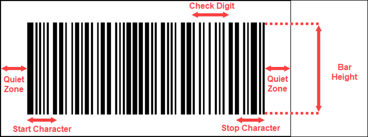
-
Quiet Zone
The zone at the left and right ends of the bar code are known as Quiet Zone. Both ends must be at least 10 times as wide as the minimum element width for proper scanning of the barcode.
-
Start Character
Start Character indicates the start of the barcode.
-
Stop Character
Stop Character indicates the end of the barcode.
-
Check Digit
Check Digit is a numeric value used to check read errors. Check Digit is located right after the barcode data.
-
Bar Height
Bar Height is the height of the barcode and is recommended to be greater than 15% of the barcode length.
Adding a Barcode Control to a Report
To add a Barcode control to a report, navigate to the Report Designer and follow the below instructions:
-
Drag and drop the Barcode control onto the Design Area from the Designer Toolbar.
-
Use the Inspector Panel on the right side of your screen to customize the appearance of the Barcode control.
Select your intended type of barcode from the Type property of the Symbology section.
Inspector Panel PropertiesCommon
| Property | Description |
|---|---|
| Name | Add a unique name to the Bullet control. Special characters such as period (.), space, ( ), forward slash (/), backslash (\), exclamation marks (!), and hyphens (-) are not supported. You can use an underscore (_) in the name of the control. |
| Value | Enter a value or an expression for the value of the barcode. Value is a key attribute of the Barcode control. |
Symbology
| Property | Description |
|---|---|
| Type | Select a type of barcode from the dropdown. |
Background & Borders
| Property | Description |
|---|---|
| Color | Select the background color of the barcode. |
| Borders | Select the type of border to apply to the barcode. Border options for barcode are - Left, Right, Top, Bottom, and All. |
| Width | Select the width of the barcode. |
| Style | Select a style for the border from the following options - Dotted, Dashed, Solid, Double, Groove, Ridge, and Inset. |
| Color | Select a color for the barcode. |
Text
| Property | Description |
|---|---|
| Font | Select the font family of the text data in the barcode. |
| Size | Select a font size from the dropdown. |
| Color | Select a font color of the text data in the barcode. |
| Weight | Select a font weight to display the text data in the barcode. |
| Style | Select an style option for the text data in the barcode. |
| Decoration | Select a decoration option for the text data in the barcode. |
Dimensions
| Property | Description |
|---|---|
| Left | Set the left margin of the Barcode control. |
| Top | Set the top margin of the Barcode control. |
| Width | Set the width of the Barcode control. |
| Height | Set the height of the Barcode control. |
Appearance
| Property | Description |
|---|---|
| Caption Location | Select an option to display the caption above or below the barcode. |
| Checksum | Checksum increases the accuracy of the barcodes. Set the flag to False to turn off Checksum. By default, this option is set a True. |
| Rotation | Select a rotation angle for the barcode to None, 90 degrees, 180 degrees, or 270 degrees. |
Layout
| Property | Description |
|---|---|
| Padding | Set the padding of the barcode. You can use the Expand button to set the padding in all four directions. |
Barcodes Symbology
| Symbology | Example | Description |
|---|---|---|
| ANSI 3 of 9 | 
|
ANSI 3 of 9 (Code 39) barcode uses upper case alphabets (A-Z), numerals (0-9), and special characters like -, *, $, /, +, and % in the symbology. |
| ANSI Extended 3 of 9 | 
|
ANSI Extended 3 of 9 (Code 39) barcode uses the complete ASCII character set. |
| Aztec | 
|
Aztec is a 2-D barcode symbology and supports all the ASCII characters (0 to 255). |
| BC412 | 
|
BC412 barcode uses 35 characters, numerals (0 to 9), and upper case alphabets (A to Z). BC412 is used in semiconductor wafer identification. |
| Codabar | 
|
Codabar barcode uses A,B,C, or D alphabets as the Start and Stop Characters. Codabar uses numerals (0 to 9) and symbols (-, $, :, /, and ;) in the remaining code symbology. |
| Code 11 | 
|
Code 11 barcode can encode numerals (0 to 9), hyphen (-), and Start/Stop Characters. Code 11 is primarily used in labeling telecommunication equipment. |
| Code 128 A | 
|
Code 128 A uses control characters, numerals (0 to 9), punctuation, and upper case alphabets (A to Z). |
| Code 128 B | 
|
Code 128 B uses punctuations, numerals (0 to 9), and upper case and lower case alphabets. |
| Code 128 C | 
|
Code 128 C uses only numerals (0 to 9). |
| Code 128 Auto | 
|
Code 128 Auto uses the complete ACSII character set. Code 128 Auto automatically selects between Code 128 A, B or C to give the smallest barcode. |
| Code 2 of 5 | 
|
Code 2 of 5 uses only numerals (0 to 9). |
| Code 93 | 
|
Code 93 uses upper case alphabets (A to Z), special characters (%, $, *, /, +, and -), and numerals (0 to 9). |
| Interleaved 2 of 5 | 
|
Interleaved 2 of 5 is a two-width barcode symbology that uses only numerals (0 to 9) and must contain even number of digits in the code. |
| Code 39 | 
|
Code 39 barcode uses numerals (0 to 9), upper case alphabets (A to Z), space character, and special characters (-, ., $, /, +, and %). |
| Extended Code 39 | 
|
Extended Code 39 barcode uses the complete ASCII character set. |
| Code 49 | 
|
Code 49 is a two-dimensional high-density stacked barcode and contains two to eight rows of eight characters each. Code 49 encodes the complete ASCII character set. Each row of the code has a start and stop code. |
| Extended Code 93 | 
|
Extended Code 93 uses the complete ASCII character set. |
| Data Matrix | 
|
Data Matrix is a two-dimensional high-density barcode symbology with square modules arranged in square or rectangular matrix pattern. |
| EAN-13 | 
|
EAN 13 barcode uses only numerals (12 numbers and a check digit). Check digit known as CheckSum is used to verify that the code has been scanned correctly. |
| EAN-8 | 
|
EAN 8 is a condensed version of EAN 13 and uses 8 digits in the code (7 numbers and a check digit). |
| EAN-128FNC1 | 
|
EAN-128FNC1 is a one-dimensional alphanumeric representation of Application Identifier (AI) data for making containers in the shipping industry. |
| GS1 Data Matrix | 
|
GS1 Data Matrix is a two-dimensional barcode used in healthcare industry. GS1 Data Matrix can take up to 2000 characters in the code. |
| GS1 QR Code | 
|
GS1 QR Code begins with the Function Code 1 (FNC1). It uses application identifiers to separate data within the barcode. Data in GS1 QR Code is stored as binary information in the square dots (known as modules). |
| HIBC Code 128 | 
|
HIBC Code 128 uses the Code 128 symbology and encodes the primary and secondary data using a slash (/) as a delimiter. HIBC Code 128 is used in the healthcare products industry for identification purposes. |
| HIBC Code 39 | 
|
HIBC Code 39 uses the Code 39 symbology and encodes the primary and secondary data using a slash (/) delimiter. HIBC Code 39 is used in the healthcare products industry for identification purposes |
| IATA 2 of 5 | 
|
IATA 2 of 5 is a modified Code 2 of 5 barcodes and uses only numeric digits with a check digit. |
| Intelligent Mail | 
|
Intelligent Mail is a 65-bar code used for domestic mail in the USA. |
| Intelligent Mail Package | 
|
Intelligent Mail Package is a modified version of Intelligent Mail and is more efficient in terms of processing and tracking mails. |
| ISBN (International Standard Book Number) | 
|
ISBN barcode is a special form of EAN 13 code and is used as a unique 9-digit commercial book identifier. The properties specific to the ISBN barcode are listed and described in this section. |
| ISMN (Internationally Standard Music Number) | 
|
ISMN barcode is a special form of EAN 13 code and is used for marking printed musical publications. The properties specific to the ISMN barcode are listed and described in this section. |
| ISSN (International Standard Serial Number) | 
|
ISSN barcode is a special form of EAN 13 code and is used to identify serial publications, publications issued in numerical order (such as the volumes of a magazine). The properties specific to the ISSN barcode are listed and described in this section. |
| ITF-14 | 
|
Interleaved 2 of 5 barcode is used to mark carton boxes containing goods with a EAN 13 code. A digit is added in the starting of the code to mark the packing variant. |
| Japanese Portal | 
|
Japanese Postal is the barcode used by Japanese Postal system. Japanese Postal barcode encodes alpha and numeric characters consisting 18 digits including 7 digits of the postal number followed by an optional block and house number information. The encoded data can include hyphens (-). |
| Matrix 2 of 5 | 
|
Matrix 2 of 5 is a higher density barcode with 3 black bars and 2 white bars. |
| MaxiCode | 
|
MaxiCode is a special polar barcode that uses 256 characters. MaxiCode is used as shipping labels for world-wide addressing and package sortation. |
| Micro PDF417 | 
|
Micro PDF417 is a two-dimensional multi-row symbology derived from PDF417. MicroPDF 417 is used for applications that needs to encode data in two dimensional symbols consisting of up to 15 bytes, 250 alphanumeric characters, or 366 numeric digits. Micro PDF417 allows you to insert FNC1 character as a field separator for variable-length Application Identifiers. |
| Micro QR Code | 
|
Micro QR Code is a 2-D barcode designed for applications that use a small amount of data and can encode up to 35 numeric characters. Micro QR Code can handle numeric and alphanumeric data including Japanese Kanji and Kana characters. |
| MSI Code | 
|
MSI Code uses only numeric digits (0 to 9). |
| PDF417 | 
|
PDF417 is a two-dimensional high-density barcode symbology that can encode up to 1108 bytes of information. PDF417 consists of a stacked set of smaller codes and can encode up to 35 alphanumeric characters or 2710 numeric characters. |
| Pharmacode | 
|
Pharmacode represents only numeric data from 3 to 131070. Pharmacode is used in the pharmaceutical industry for packaging purposes and is designed to be readable despite printing errors. |
| Plessey | 
|
Plessey barcode uses hexadecimal digits to encode. Plessey is a one-dimensional barcode mainly used in libraries. |
| PostNet | 
|
PostNet barcode uses numeral digits (0 to 9) with a check digit. |
| PZN (Pharmaceutical Central Number) | 
|
PZN barcode uses the same encoding algorithm as Code 39. However, PZN can carry only - 0123456789 digits and supports 6 or 7 digits for encoding. The PZN and a check digit are automatically added to the code. PZN is mainly used in medicine and healthcare products in Germany and other German speaking countries. |
| QR Code | 
|
QR Code is a two-dimensional barcode symbology that is capable of handling numeric, alphanumeric, and byte data along with Japanese Kanji and Kana characters. QR Codes can encode up to 7366 characters. |
| RM4SCC (Royal Mail) | 
|
RM4SCC uses letters and numerals with a check digit. RM4SCC is a barcode used by the Royal Mail in United Kingdom. |
| RSS-14 | 
|
RSS-14 is a 14 digit Reduced Space Symbology barcode that uses EAN.UCC item identification omni-directional scanning in point-of-scale laser scanners. The RSS family of the barcodes is also known as GS1 DataBar. |
| RSS-14 Stacked | 
|
RSS-14 Stacked barcode uses EAN.UCC information with Indicator digits stacked in two rows for a smaller width. The properties specific to the RSS-14 Stacked barcode are listed and described in this section. |
| RSS-14 Stacked Omnidirectional | 
|
RSS-14 Stacked Omnidirectional barcode uses the EAN.UCC information with omnidirectional scanning is stacked in two rows for a smaller width. |
| RSS-14 Truncated | 
|
RSS-14 Truncated barcode uses the EAN.UCC information and includes Indicator digit of zero or one for smaller items not scanned at the point-of-sale. |
| RSS Expanded | 
|
RSS Expanded barcode uses EAN.UCC information along with AI elements such as weight and best-before dates. RSS Expanded lets you insert an FNC1 character as a field separator for variable-length Application Identifiers (AI). |
| RSS Expanded Stacked | 
|
RSS Expanded Stacked barcode uses the EAN.UCC information with AI elements and are stacked in two rows for a smaller width. RSS Expanded Stacked lets you insert an FNC1 character as a field separator for variable length Application Identifiers (AI). |
| RSS Limited | 
|
RSS Limited barcode uses EAN.UCC information including Indicator digits of zero or one for using on small items not scanned at the point of sale. |
| SSCC-18 | 
|
SSCC-18 is an 18-digit Serial Shipping Container Code. SSCC-18 is used to identify individual shipping containers for tracking purposes. |
| Telepen | 
|
Telepen barcode has two modes - alphanumeric only and numeric only. Both modes require a start character, a check digit, and a stop character. Telepen is mainly used in manufacturing industries. |
| UCC/EAN-128 | 
|
UCC/EAN 128 barcode complies to GS1-128 standards and uses a series of Application Identifiers (AIs) to encode data. UCC/EAN 128 uses the complete ASCII character set and the FNC1 character as the first character position. Using AIs, it encodes Best Before Date, Batch Number, Weight, and such other attributes. UCC/EAN-128 barcode symbology is used in HIBC applications. |
| UPC-A | 
|
UPC-A barcode symbology uses only numerals (11 numeric digits and a check digit). |
| UPC-E0 | 
|
UPC-E0 barcode uses only numerals and is used for zero-compression UPC symbols. The first digit of the barcode signifies the number system (always 0 for this code type) and the last digit as the check digit. |
| UPC-E1 | 
|
UPC-E1 barcode uses only numerals and is used for shelf labelling in retail industry. The first digit of the barcode signifies the number system (always 1 for this code type) and the last digit as the check digit. Length on the input string of the UPC-E1 barcode is six numeric characters. |
Barcode Specific Properties
Aztec
| Property | Description |
|---|---|
|
Layers |
Indicates the number of barcode layers. Set the number of layers ranging from 0 to 32 using this property. |
|
Error Correction |
Indicates whether to allow code recovery in case the barcode is partially damaged. Set the correction value ranging from 5% to 95% using this property. |
|
Encoding |
Select a barcode encoding pattern from the dropdown. |
Code 49
| Property | Description |
|---|---|
|
Grouping |
To use grouping for the Code 49 barcode, set this property to True. When set to true, any value that cannot be expressed in a single barcode will be split into several barcode grouped together. By default, this property is set as False. |
|
Group Number |
Set a number ranging from 0 to 8 from barcode grouping. |
Data Matrix
| Property | Description |
|---|---|
|
Ecc Mode |
Select a ECC Mode from the dropdown. The available options are - ECC000, ECC050, ECC080, ECC100, ECC140, and ECC200. |
|
Ecc200 Symbol Size |
Select the size of the ECC200 symbol from the dropdown. By default, the value of this property is set as SquareAuto. |
|
Ecc200 Encoding Mode |
Select the encoding mode for ECC200 from the dropdown. The available options are - Auto, ASCII, C40, Text, X12, EDIFACT, and Base256. |
|
Ecc000_140 Symbol Size |
Select the size of the ECC000_140 symbol from the dropdown. |
|
Structure Append |
To make the barcode a part of the structured append symbol, set the Structure Append property to True. By default, this property is set as False. |
|
Structure Number |
Enter the structure number of the barcode symbol within the structured append symbols. |
|
File Identifier |
Enter the file identifier of a related group of the structured append symbols ranging from 0 to 254. If you set the File Identifier value as 0, the file identifier symbols are calculated automatically. |
|
Encoding |
Select a barcode encoding pattern from the dropdown. |
EAN-13 and EAN-8
| Property | Description |
|---|---|
|
Caption Grouping |
To add spaces between groups of characters in the caption to make long numbers easier to read, set the Caption Grouping property to True. By default, this property is set as False. |
|
Supplement Value |
Enter a value or expression to set the value of the barcode supplement. |
|
Supplement Bar Height |
Enter the bar height of the barcode supplement. |
|
Supplement Spacing |
Enter the spacing between the main and supplement barcodes. |
|
Supplement Spacing |
Enter the spacing between the main and supplement barcodes. |
|
Supplement Caption Location |
Select the location of the supplement caption from the dropdown. The available options are - None, Above, and Below. |
EAN-128FNC1
| Property | Description |
|---|---|
|
Dpi |
Specify the printer resolution ranging between 0 to 999999 using the Dpi property. Use the + and - sign buttons to increase or reduce the Dpi value. |
|
Module Size |
Enter the horizontal size of the EAN-129FNC1 barcode module. |
|
Bar Adjust |
Enter the adjustment size (dot units) which affects the size of the module only. |
GS1 Data Matrix
| Property | Description |
|---|---|
|
Symbol Size |
Select the size of the Data Matrix symbol from the dropdown. |
|
Symbol Size |
Select the size of the Data Matrix symbol from the dropdown. |
|
Encoding Mode |
Select an encoding mode from the following options - Auto, ASCII, C40, Text, X12, EDIFACT, and Base256. |
|
Structured Append |
To make the barcode a part of the structured append symbol, set the Structure Append property to True. By default, this property is set as False. |
|
Structure Number |
Enter the structure number of the barcode symbol within the structured append symbols. |
|
File Identifier |
Enter the file identifier of a related group of the structured append symbols ranging from 0 to 254. If you set the File Identifier value as 0, the file identifier symbols are calculated automatically. |
GS1 QR Code
| Property | Description |
|---|---|
| Version |
Enter the version of the Micro QR Code barcode style ranging from 1 to 40. |
| Error Level | Select the error correction level for the arcode form the dropdown. The available options are -M, L, H and Q. |
| Mask | Select the barcode masking pattern from the dropdown. The available options are Auto, Mask000, Mask001, Mask010, Mask011, Mask100, Mask101, Mask110, and Mask111. |
| Encoding | Select a barcode encoding pattern from the dropdown. |
ISBN, ISMN, and ISSN
| Property | Description |
|---|---|
| Caption Grouping | To add spaces between groups of characters in the caption to make long numbers easier to read, set the Caption Grouping property to True. By default, this property is set as False. |
MaxiCode
| Property | Description |
|---|---|
| Mode | Select the mode of the MaxiCode barcode from the dropdown. The available options are - Mode2, Mode3, Mode4, Mode5, and Mode6. |
Micro PDF417
| Property | Description |
|---|---|
|
Compaction Mode |
Select the compaction mode from the dropdown. The available options are - Auto, TextCompactionMode, NumericCompactionMode, or ByteCompactionMode. |
|
Version |
Select the version to set the symbol size. |
|
Segment Index |
Enter the segment index of the structured append symbol ranging from 0 to 99998. The Segment Index value should be less than the value in the Segment Count. |
|
Segment Count |
Enter the segment count the structured append symbol ranging from 0 to 99999. |
|
File ID |
Enter the File ID of the structured append symbol ranging from 0 to 899. |
Micro QR Code
| Property | Description |
|---|---|
|
Version |
Select the version number of the Micro QR Code from the dropdown. The available options are - Auto, M1, M2, M3, and M4. |
|
Error Level |
Select the error correction level for the Micro QR Code from the dropdown. The available options are - L, M, and Q. |
|
Mask |
Select the masking pattern from the dropdown. The available options are - Auto, Mask00, Mask01, Mask10, and Mask11. |
|
Encoding |
Select a barcode encoding pattern from the dropdown. |
PDF417
| Property | Description |
|---|---|
|
Columns |
Enter the column numbers of the barcode ranging from 1 to 30. The default value of the Columns property is -1. |
|
Rows |
Enter the row numbers for the barcode ranging from 3 to 90. The default value of the Row property is -1. |
|
Error Correction Level |
Enter the error correction level for the barcode ranging from 0 to 8. The error correction capability increases as the value increases. With the increase in the value of the Error Correction Level property, the size of the barcode increases. The default value of this property is -1. |
|
PDF417 Type |
Select the type of the PDF417 barcode from the dropdown. The available options are - Normal and Simple. Use the simple option for compact type barcode where the right indicator is not displayed or printed. |
QR Code
| Property | Description |
|---|---|
|
Connection |
To use the connection for QR Code, set this property as True. The Connection property is used in conjunction with the Connection Number property. By default, this property is set as False. |
|
Connection Number |
Enter the correction number for the barcode ranging from 0 to 15. Connection Number is used to set the number of barcodes it can split into. |
|
Version |
Enter the version of the QR Code to specify the size of the barcode. Increase in the value of the version increases the size of the barcode enabling to store more information. When the Model property as described below is set as Model1, specify a version value ranging from 1 to 14 and when the Model property is set as Model2, specify a version value ranging from 1 to 40.The default value of Version is -1. |
|
Error Level |
Select the error correction level for the QR Code from the dropdown. The available options are - M, L, H, and Q. |
|
Mask |
Select the barcode masking pattern from the dropdown. The available options are - Auto, Mask000, Mask001, Mask010, Mask011, Mask100, Mask101, Mask110, and Mask111. |
|
Model |
Select the model of the QR Code from the dropdown. The available options are Model1 and Model2. |
|
Encoding |
Select a barcode encoding pattern from the dropdown. |
RSS-14 Stacked and RSS Limited
| Property | Description |
|---|---|
|
Caption Grouping |
To add spaces between groups of characters in the caption to make long numbers easier to read, set the Caption Grouping property to True. By default, this property is set as False. |
|
Composite Type |
Select the composite type for the barcode from the dropdown. The available options are - None and CCA. |
|
Composite Value |
Enter the value of the composite barcode using the Composite Value property. |
RSS Expanded Stacked
| Property | Description |
|---|---|
|
Caption Grouping |
To add spaces between groups of characters in the caption to make long numbers easier to read, set the Caption Grouping property to True. By default, this property is set as False. |
|
Row Count |
Enter the number of stacked rows of the RSS Expanded Stacked barcode. |
UPC-A, UPC-E0, and UPC-E1
| Property | Description |
|---|---|
|
Caption Grouping |
To add spaces between groups of characters in the caption to make long numbers easier to read, set the Caption Grouping property to True. By default, this property is set as False. |
|
Supplement Value |
Enter a value or expression to set the value of the barcode supplement. |
|
Supplement Bar Height |
Enter the bar height of the barcode supplement. |
|
Supplement Spacing |
Enter the spacing between the main and supplement barcodes. |
|
Supplement Caption Location |
Select the location of the supplement caption from the dropdown. The available options are - None, Above, and Below. |
Formatted text
The Formatted Text control can perform mail merge operations, and it displays richly formatted text in HTML. You can format the Formatted Text report control by entering the HTML code into the Html property. You can freely expand the content of the report through HTML coding.
Using Formatted Text Control in a Report Designer
Follow the below steps to add a Formatted Text control.
-
From the Report Toolbox on the left either drag and drop the Formatted Text control onto the design area or left click the control. You can also add it to the List control.
-
You can set the properties of the control.
Select the control and click the Properties tab. The list of properties related to the Formatted Text control is displayed.
Properties Tab
You can set the Formatted Text control appearance by setting properties in the Properties tab. Properties like adding a border, layout, visibility, etc. can be customized.
Listed below are the common properties.
Common
-
Name
Sets the name of the selected Formatted Text control.
Content
This sets the mail merge options for the control.
-
Html
To format the text in the control enter HTML code here. Click the Data Binding option and select the Expression to add the HTML code. All text written in the Html property must be enclosed in the tags.
-
Encode Merge Fields
This setting controls the encoding behavior of mail merge fields. Set this option to True to encode the mail merge fields.
-
Merge Fields
This option sets the mail merge fields. Click the Plus button to add a new mail merge field to the Formatted Text. Mail merges can be deleted them using the X button.
-
Field Name
Enter the name of the field that is unique within the report. This is used in the Html property inside <%FieldName%> tags to display the field in the formatted text.
-
Value
Enter an expression to pull data into the control for mail merge operations or you can select the field from the dataset by clicking the Pick Data option.
-
Background
This sets the background of the Formatted Text control.
-
Color
This option sets the color to be used as a background for the Formatted Text. You can select the color by selecting from the dropdown list.
-
Image
This option sets the background image of the Formatted Text control. Click the dropdown list to select the image source. Shared refers to the images that are uploaded on the portal, Embedded refers to the new images that you can select and upload, Database refers to the database graphics field. Click the Expand icon to display more image properties.
-
Source
This is the source from which the image is coming.
-
Value
This refers to the image selected from the source.
For example:
If the image source is "Shared" you'll need to select the specific shared image here.
-
MIME Type
This refers to the image format like png, gif, etc.
-
Repeat
This defines the way in which the image covers the Formatted Text control.
-
Repeat
This option repeats the image both height-wise and width-wise until the background area is covered.
-
NoRepeat
When this option is selected, then the image is not repeated and is displayed only once.
-
RepeatX
This option repeats the picture horizontally (width-wise).
-
RepeatY
This option repeats the picture vertically (height-wise).
-
-
Border
This sets the border of the Formatted Text.
- Width
You can set the thickness of the border of the Formatted Text using this option. By clicking the Expand icon you can set the width of the border of all the sides of the Formatted Text. - Style
Select the border line style of the Formatted Text from the dropdown list. By clicking the Expand icon, you can set the style of the border of all the sides of the Formatted Text, as required. - Color
Select the border color from the dropdown list. By clicking the Expand icon you can select the color of the border of all the sides of the Formatted Text.
Dimensions
This sets the location and size of the Formatted Text.
- Left
This option sets the landscape position of the Formatted Text to be maintained from the upper left side in the report. - Top
This option sets the vertical position of the Formatted Text to be maintained from the top in the report. - Width
This option sets the width of the Formatted Text. - Height
This option sets the height of the Formatted Text.
Layout
This sets the Formatted Text layout in a report.
- Style
This sets the theme of the control. - Layer Name
Sets the report layer. - Z-Index
This property sets the position of the Formatted Text control when there are multiple formatted text controls stacked together. The formatted text with a greater Z-Index value will always be in front of the Formatted Text that has a lower Z-Index value.
Visibility
This sets the visibility of the Formatted Text on the report preview.
- Hidden
This option sets whether to hide the formatted text or not on the preview. Set it to True to display it. By default it is set to False. - Toggle Item
Visibility can be toggled by another report item. This option can be used to set another item such as a text box as a toggle button that can display or hide the current Formatted Text.
Data
This sets the XML data output properties.
-
Element Name
Enter a name to be used in the XML output for this Formatted Text report control.
-
Element Output
Choose Auto, Output, NoOutput, or ContentsOnly to decide whether to include this Formatted Text in the XML output. Choosing Auto exports the contents of the Formatted Text report control.
Misc Options
- Tooltip
Sets the textual label of the Formatted Text when the mouse is hovered over it. - Label
Sets a textual content that is used as a display text for the report catalog items. The report catalog is made using the Table of Contents element in the Toolbox and the table of contents is used for quick positioning jumps in multi-page reports. - Bookmark
You can enter text or an expression to use as a positioning identifier to jump to this element. You can define the bookmark and then select the jump to bookmark setting, to make it easier to jump between report content. You can bookmark any element in the report to make it a destination anchor for the jump.
Using Mail Merge in Formatted Text Control
To create a mail merge report, follow the below steps.
-
With the Report Designer open select the Properties tab and select Data Set Name under the Data section.
-
Under the Group section add the Group Expressions by clicking the Plus icon.
-
Click the Data Binding and select the ProductKey field from the data set.
-
Drag and drop the Formatted Text control on the List data region. Check from the Report Explorer that the Formatted Text is nested within the List data region.
-
Set the Encode Mail Merge field to True.
-
Add the Merge Fields. Click the Add Item icon and click the Data Binding option and select your required mail merge fields from the dataset.
-
Set the Html property by clicking the Data Binding option and then selecting the Expression option. The Expression Editor is displayed.
-
You can add the HTML code in the Expression Editor.
-
Format the appearance of the report control and preview it.
Sparkline
The Sparkline control is used to display data trends on a small graph in your reports. Sparkline shows the most recent value of the data at the rightmost point and compares it with an earlier value allowing you to view general changes in the data over time. The Sparkline control supports line, column, profit and loss, area, and stacked charts. Sparkline can be embedded within tables to gain a better understanding and analysis of business data.
Sparkline Structure
-
Series Value
A series value is used to show a set of data in the Sparkline chart.
-
Grouping Expressions
Grouping expressions are used to group data in the Sparkline.
Adding a Sparkline to a Report
-
With the Report Designer open, drag and drop the Sparkline control onto the Design Area from the Designer Toolbar.
-
Use the Inspector Panel on the right side of your screen to customize the appearance of the Sparkline control.
Inspector Panel Properties
Common
| Property | Description |
|---|---|
|
Name |
Add a unique name to the Sparkline control. Special characters such as period (.), space ( ), forward slash (/), backslash (\), exclamation marks (!), and hyphens (-) are not supported. You can use an underscore (_) in the name of the control. |
|
Sparkline Type |
Select the chart type for the sparkline control. Use the dropdown to select one of the following options: Line, Columns, Whiskers, Area, or StackedBar. |
| Series Value | Enter a value or an expression to use as a series value for the sparkline control. |
Dimensions
| Property | Description |
|---|---|
| Left | Set the left margin of the Sparkline control. |
|
Top |
Set the top margin of the Sparkline control. |
|
Width |
Set the width of the Sparkline control. |
| Height | Set the height of the Sparkline control. |
Layout
| Property | Description |
|---|---|
|
Style |
Select a color theme for the Sparkline control from the dropdown. |
Group
| Property | Description |
|---|---|
|
Name |
Add a unique name to the details group. Special characters such as period (.), space, ( ), forward slash (/), backslash (\), exclamation marks (!), and hyphens (-) are not supported. You can use an underscore (_) in the name of the group. |
|
Group Expression |
Add grouping expressions such as field names to the sparkline control using the + button |
Data
| Property | Description |
|---|---|
|
Data Set Name |
Select a dataset from the dropdown to bind the data to the sparkline control. |
| Data Set Parameters | Add parameters to the dataset using the + button. Dataset parameters can be values or expressions. |
| Sort Expressions | Set a sort expression for the sparkline control using this property. |
| Filters | Add filters to filter out the data from the report. |
Overflow Placeholder
The Overflow Placeholder control is only available in the Page Report. It is a rectangular placeholder for data that does not fit inside the fixed size of a List, Tablix, or Table data region.
The fixed-size page layout does not allow you to change sizes based on the data in the fixed page layout. Accordingly you can link a data region to an Overflow Placeholder.
The control gets its Size property values from the FixedSize of the data region it is linked with. Data that overflows from the fixed size of your tables or other data regions can span pages but you can control the layout of each page and specify where the overflow data goes with an Overflow Placeholder.
Using Overflow Placeholder Control in a Report Designer
This section describes how to use an Overflow Placeholder control in a report.
-
You can bind the overflow data from a data region to an Overflow Placeholder control.
-
You can place multiple Overflow Placeholder controls in a report to create different looks for your report output. If you are using multiple Overflow Placeholder controls then you should link a data region to an Overflow Placeholder control and then link that Overflow Placeholder control to another Overflow Placeholder control. Two common layouts that you can create are:
-
Columnar Report Layout
Place the data region and the Overflow Placeholder on the same page of the report to create a layout that displays data in a columnar format.
-
Multiple Page Layout
Place the data region on the first page of the report and the Overflow Placeholder controls on subsequent pages to create a layout with overflow data on multiple pages.
-
Properties Tab
You can set the Overflow Placeholder control appearance by setting properties in the Properties tab. Listed below are the common properties.
Properties Table
| Property | Description |
|---|---|
| Common |
|
| Dimensions |
This sets the location and size of the Overflow Placeholder.
|
| Layout |
This sets the Overflow Placeholder layout in a report as a whole.
|
Data Analysis and Interactivity
An interactive report makes the data analysis process easier by letting the end users modify the report data during the run-time. This gives users more control over the data as they can modify and view the desired information to improve decision-making. Non-technical users can prepare highly interactive reports without assistance from IT professionals. The Report Designer supports features interactive features like parameters, drill-down, filters, links, sorting and document map
-
Parameters
Report parameters are typically used to filter the report data at run time. You can either set default values to the parameters or prompt the users to enter the parameter values at the run time.
-
Drill-Down
The drill down feature is useful in analyzing the multidimensional data in the reports. It allows users to navigate from a summarized view to a more detailed view by going one step deeper.
-
Filters
Filters in reports allow users to display only the relevant information in the reports. Filters can be used to limit and manipulate the information displayed in reports.
-
Sorting
Sorting data enables users to organize the data and present it in a logical order at run-time. It allows users to sort the data alphabetically or numerically in ascending or descending order.
-
Document Map
The document map feature allows users to navigate to any item in the report by simply clicking that item.
-
Bookmarks, Hyperlinks, and Drill-through Links
These links allow users to navigate to any bookmarked item in a report, to an external web page or to another report for more detailed information.
Jump To
The Jump To feature helps you create shortcuts from one report to another report, bookmark, or URL (internal or external) in a pop-up dialog. The Jump To feature helps you quickly find additional details of a particular data series by jumping to another document or a URL. The Jump To feature is supported in all report controls such as table, textbox, container, table of contents, etc.
Creating a Jump to Scenario
To create a Jump To follow the below instructions:
-
Navigate to the Report Designer.
-
Select a report control and navigate to the Action section of the Inspector panel.
-
From the Type dropdown menu select a Jump To action (Jump to Report, Jump to Bookmark, or Jump to URL).
-
Jump to Report
When using the Jump to Report type choose a report from the Jump To Report dropdown menu and adjust the parameters as needed.
-
Jump to Bookmark
When using the Jump to Bookmark type choose an existing bookmark of the report from the Jump To Bookmark dropdown menu.
-
Jump to URL
When using the Jump to URL type add the desired URL for the jump to action in the Jump To URL text box.
-
-
Navigate to the Preview Report page and follow the below instructions (depending on what type of Jump To, you selected).
Jump to a Report
-
On the preview report page select the report control that you applied the Jump to Report action to.
-
If the report has parameters select your intended parameters and click the Preview button.
-
The report linked to the jump to action will appear on your screen.
Jump to a Bookmark
-
On the preview report page select the report control that you applied the Jump to Bookmark action to.
-
On clicking the report control you will be navigated to the associated bookmark.
Jump to a URL
-
On the preview report page select the report control that you applied the Jump to URL action to.
-
You will be navigated to the URL entered in the Jump To URL input box on the Inspector Panel.
Expression Editor
You can use an expression to set the value of a control in the report or set conditions under which certain styles apply. You can set expressions through the Expression Editor dialog while setting values in the Properties window. The editor allows you to choose from several fields available to the report as well as to a particular property.
You can access the Expression Editor by selecting nearly any property of a control and choosing <Expression...> from the drop-down list.
All expressions are enclosed within curly braces {}. Even the expression for a field value for a TextBox is set as follows: {LastName}
The Date & Time functions used to define the date and time values display the date in MM/DD/YYYY and the time in HH:mm:ss format. While building an expression you can directly add the entire expression or part of it in the Expression pane of the Expression Editor. Then use the Insert or Append buttons to create a complete expression.
Concatenating Fields and Strings
You can concatenate fields with strings and with other fields.
For example:
Use the following expression to get a result such as "Customer Name: Smith, John":
Customer Name: {LastName} , {FirstName}
Conditional Formatting
You can concatenate fields with strings and with other fields. You can highlight a part of data by using expressions in properties like Color, Font, Border, etc. on specific field values based on a condition.
For example:
-
The formula for conditional formatting is:
{IIF(<Condition>, <TruePart>, <FalsePart>)}
-
if you enter the following expression in the Font > FontWeight property of a textbox that displays the names of people you will get the name "Denise" in bold.{IIF(FirstName ("Denise", "Bold", "Normal"))}
Attributes of the Expression Editor
The Expression Editor has three major attributes.
-
Expression pane
-
Values
-
Functions
Expression Pane
The Expression pane is the input area of the Expression Editor window where you enter the expressions such as a string.
All expressions are enclosed within curly braces '{}'. Even the expression for a field value for a TextBox is set as: {LastName}
Values
Values are the input fields available to the selected report. The following Values are available in the Expression Editor.
-
Constants
This refers to static constants like numbers or strings. For example 123, and "abc".
-
Common Values
Common Values are built-in field values of the report. For example the current page number and the total number of pages.
-
Parameters
These nodes represent the parameters of the report defined in the Report Designer.
-
Data Sets
These nodes list the datasets and fields linked to the selected report.
-
Operations
Operations list the arithmetic, comparison, concatenation, logical/bitwise, and bit shift operators.
-
Documents Map:
This defines the labels of the TOC (Table of Content) members of the selected report.
-
Theme:
The theme refers to the visual settings including fonts, colors, constant, and images. A combination of two or more theme elements is used to increase the graphical appeal of a table in the selected report.
-
Report Items
Report Items refer to the field items available as textboxes in the selected report.
Functions
You can use various aggregate and other functions in your expressions including the running value, population standard variance, standard deviation, count, minimum and maximum.
For example:
-
You could use the following expression to get a count of employees.
{Count(EmployeeID, Nothing)}
Creating Expressions
Accessing the Expression Editor
-
Navigate to the Resource or Document Portal > Categories tab.
-
Select a report under the Document pane. Either click the Edit button on the top-right corner of the window or click the Ellipses icon and then click the Edit option. The selected report will open in edit mode.
-
Select the text box you wish to create or edit the expression for.
Under the Properties grid on the right side of your screen, click the yellow square box next to the Value property in the Common section and click the Expression option. The Expression Editor window will appear on your screen.
Creating or Editing Expressions
-
In the Expression Editor window select an expression element from the Values or Functions section or directly enter the expression in the Expression pane. Double-click the expression element to add it to the Expression pane.
-
Click the Save button to add the expression.
-
To resize the Expression Editor dialog click and drag the resize button on the bottom left corner of the dialog box. To move the Expression Editor dialog, click and drag the header section of the dialog box.
List of Values
Common Values are run-time values available for every property in each report. You can directly drag and drop these common values from the Report Explorer onto the design surface or add and modify the values from the Expression Editor. Following is a list of the values that you can see under the Values node in the Report Explorer and the Expression Editor.
The following tables list all available values.
Common Values
| Value | Description | Expression |
|---|---|---|
| Current Date and Time | Displays the current date and time. The date and time are displayed in MM/DD/YYYY and HH:mm:ss 12-hour format. It can be used in the Page Header and Page Footer. | {&ExecutionTime} |
| Page Number | Displays the current page number. It can be used in the Page Header and Page Footer. | {&PageNumber} |
| Total Pages | Displays the total number of pages. It can be used in the Page Header and Page Footer. | {&TotalPages} |
| Page N of M | Displays the current page number (N) and the total number of pages (M) in the format 'N of M'. It can be used in the Page Header and Page Footer. | Page {&PageNumber} of {&TotalPages} |
| Page Number (Section) | Displays the current page number of the section to which the function belongs. The section can be a report or a data region. | {&PageNumberInSection} |
| Total Pages (Section) | Displays the total number of pages of the section to which the function belongs. The section can be a report or a data region. | {&TotalPagesInSection} |
| Page N of M (Section) | Displays the current page number (N) and the total number of pages (M) in the format 'N of M,' of the section to which the function belongs. The section can be a report or a data region. | Page {&PageNumberInSection} of {&TotalPagesInSection} |
| Report Name | Displays the name of the report. | {&ReportName} |
| User ID | Displays the User ID of the user previewing the report. | {User!UserID} |
| User Language | Displays the Language of the user previewing the report as per system settings. | {User!Language} |
| User Context | "Use only with function, e.g. UserContext.GetValue(""name""), UserContext.NumberToWords(123)." | {UserContext} |
Arithmatic
| Value | Description | Expression |
|---|---|---|
| ^ | Raises a number to the power of another number. | S: <Number1> ^ <Number2> E: {Quantity ^ 2} |
| * | Evaluates the multiplication of two numbers. | S: <Number1> * <Number2> E: {Quantity * 5} |
| / | Divides two numbers (numerator by denominator) and returns the quotient as a floating-point number. | S: <Number1> / <Number2> E: {AnnualSales / 2} |
| ** | Divides two numbers and returns an integer result. | S: <Number1> \ <Number2> E: {AnnualSales \ 2} |
| Mod | Divides two numbers and returns the remainder. | S: <Number1> Mod <Number2> E: {AnnualSales Mod 12} |
| + | Evaluates the sum of two numbers or concatenates two strings. | S: <Value1> + <Value2> E: {Quantity + 2} |
| - | Evaluates the difference between two numbers or negates the value of a numeric expression. | S: <Number1> - <Number2> E: {Quantity - 2} |
Comparison
| Value | Description | Expression |
|---|---|---|
| < | Returns True if the left operand is less than the right operand. | S: <Value1> < <Value2> E: {AnnualSales < 80000} |
| <= | Returns True if the left operand is less than or equal to the right operand. | S: <Value1> <= <Value2> E: {AnnualSales <= 80000} |
| > | Returns True if the left operand is greater than the right operand. | S: <Value1> > <Value2> E: {AnnualSales > 80000} |
| >= | Returns True if the left operand is greater than or equal to the right operand. | S: <Value1> >= <Value2> E: {AnnualSales >= 80000} |
| = | Returns True if the left operand is equal to the right operand. | S: <Value1> = <Value2> E: {AnnualSales = 80000} |
| <> | Returns True if the left operand is not equal to the right operand. | S: <Value1> <> <Value2> E: {AnnualSales <> 80000} |
| Like | Compares two strings and returns True if the left operand is the same as the right operand. | S: <String1> Like <String2> E: {FirstName Like "A*"} |
| Is | Compares two object references and returns True if the left operand is identical to the right operand. | S: <Value1> Is <Value2> E: {FirstName Is LastName} |
Concatenation
| Value | Description | Expression |
|---|---|---|
| & | Returns the string value of the concatenation of two expressions that individually evaluate to strings. | S: <String1> & <String2> E: {FirstName & " " & LastName} |
| + | Evaluates the sum of two numbers or concatenates two strings. | S: <String1> + <String2> E: {FirstName + " " + LastName} |
Logical/Bitwise
| Value | Description | Expression |
|---|---|---|
| And | Returns the logical conjunction of two Boolean expressions, or the bitwise conjunction of two numeric expressions. | S:<Value1> And <Value2> E: {AnnualSales > 80000 And Quantity > 5} |
| Not | Returns the logical negation of a Boolean expression, or the bitwise negation of a numeric expression. | S: Not <Value> E: {Not AnnualSales > 80000} |
| Or | Returns the logical disjunction of two Boolean expressions, or the bitwise disjunction of two numeric values. | S: <Value1> Or <Value2> E: {AnnualSales > 80000 Or Quantity > 5} |
| Xor | Returns a logical exclusion operation of two Boolean expressions, or a bitwise exclusion of two numeric expressions. | S: <Value1> Xor <Value2> E: {AnnualSales > 80000 Xor Quantity > 5} |
| AndAlso | Returns the logical conjunction of two Boolean expressions by skipping evaluation of the other expression if the evaluation of the first expression provides the result. | S: <Boolean1> AndAlso <Boolean2> E: {AnnualSales > 80000 AndAlso Quantity > 1} |
| OrElse | Returns the logical disjunction of two Boolean expressions by skipping evaluation of one expression if the evaluation of the other expression provides the result. | S: <Boolean1> OrElse <Boolean2> E: {AnnualSales > 80000 OrElse Quantity > 1} |
Bit Shift
| Value | Description | Expression |
|---|---|---|
| << | Performs an arithmetic left shift on a bit pattern. | S: <Number1> << <Number2> E: {RegionID << 2} |
| >> | Performs an arithmetic right shift on a bit pattern. | S: <Number1> >> <Number2> E: {RegionID >> 2} |
Document Map
| Value | Description | Expression |
|---|---|---|
| Path | Returns the path of the TOC level. | {DocumentMap.Path} |
List of Functions
You can use a function in an expression to perform actions on data in data regions, groups, and datasets. You can access these functions under the Functions node within the Expression Editor dialog. In any property that accepts expressions you can use the dropdown and select <Expression> to open the dialog.
The following tables contain details about each of the functions included for use in Property expressions.
Date & Time
| Value | Description | Expression |
|---|---|---|
| DateAdd | Returns a date and time value that is the result of adding the interval to the date and time field of the specified unit. | S: DateAdd(DateInterval,Number,DateTime) E: {DateAdd("d", 5, SaleDate)}; {DateAdd(DateInterval.Day, 5, SaleDate)} |
| DateDiff | Returns the difference between the start date and time and end date and time of the specified unit. | S: DateDiff(<DateInterval>, <DateTime1>, <DateTime2>[, <DayOfWeek>[, <WeekOfYear>]]) E: {DateDiff("yyyy", SaleDate, "1/1/2015")}; {DateDiff(DateInterval.Year, SaleDate, "1/1/2015")} |
| DatePart | Returns the Integer value that represents the specified part of the given date. | S: DatePart(<DateInterval>, <DateTime>[, <FirstDayOfWeek>[, <FirstWeekOfYear>]]) E: {DatePart("m", SaleDate)} |
| DateSerial | Returns a Date value that represents a specified year, month, and day, with the time information set to midnight (00:00:00). | S: DateSerial(<Year Number>, <Month Number>, <Day Number>) E: {DateSerial(DatePart("yyyy", SaleDate) - 10, DatePart("m", SaleDate) + 5, DatePart("d", SaleDate) - 1)} |
| DateString | Returns the String value that represents the current date in your system. | S: DateString() E: {DateString()}; {DatePart("m", DateString())} |
| DateValue | Returns a Date value that contains the information on date represented by a string, with the time set to midnight (00:00:00). | S: DateValue(<StringDate>) E: {DateValue("December 12, 2015")} |
| Day | Returns an Integer value from 1 through 31 that represents the day of the month. | S: Day(<DateTime>) E: {Day(SaleDate)} |
| Hour | Returns an Integer value from 0 through 23 that represents the hour of the day. | S: Hour(<DateTime>) E: {Hour(SaleDate)} |
| Minute | Returns an Integer value from 0 through 59 that represents the minute of the hour. | S: Minute(<DateTime>) E: {Minute(SaleDate)} |
| Month | Returns an Integer value from 1 through 12 that represents the month of the year. | S: Month(<DateTime>) E: {Month(SaleDate)} |
| MonthName | Returns the name of the month specified in the date as a String. | S: MonthName(<Month Number>[, <Abbreviate>]) E: {MonthName(MonthNumber)} |
| Now | Returns the current date and time in your system. | S: Now() E: {Now()} |
| Second | Returns an Integer value from 0 through 59 that represents the second of the minute. | S: Second(<DateTime>) E: {Second(SaleDate)} |
| TimeOfDay | Returns a Date value containing the current time of day in your system. | S: TimeOfDay() E: {TimeOfDay()} |
| Timer | Returns a Double value that represents the number of seconds elapsed since midnight. | S: Timer() E: {Timer()} |
| TimeSerial | Returns a Date value that represents a specified hour, minute, and second, with the date information set relative to January 1 of the year 0001. | S: TimeSerial(<Hour Number>, <Minute Number>, <Second Number>) E: {TimeSerial(DatePart("h", SaleDate), DatePart("n", SaleDate), DatePart("s", SaleDate))} |
| TimeString | Returns the String value that represents the current time of day in your system. | S: TimeString() E: {TimeString()} |
| TimeValue | Returns a Date value that contains the information on time represented by a string, with the date set to January 1 of the year 0001. | S: TimeValue(<StringTime>) E: {TimeValue("15:25:45")}; {TimeValue(SaleDate)} |
| Today | Returns a Date value that contains the current date in your system. | S: Today() E: {Today()} |
| Weekday | Returns an Integer value that contains a number representing the day of the week. | S: Weekday(<DateTime>[,<DayOfWeek>]) E: {Weekday(SaleDate, 0)} |
| WeekdayName | Returns a String value that contains the name of the specified weekday. | S: WeekdayName(<WeekDay>[, <Abbreviate>[, <FirstDayOfWeek>]]) E: {WeekdayName(3, true, 0)}; {WeekDayName(DatePart("w", SaleDate), true, 0)} |
| Quarter | Returns an Integer value from 1 through 4 that represents the quarter of the year. | S: Quarter(<DateTime>) E: {Quarter(SaleDate)} |
| QuarterName | Returns a String value that represents the quarter of the year. | S: QuarterName(<DateTime>) E: {QuarterName(SaleDate)} |
| Year | Returns an Integer value from 1 through 9999 representing the year. | S: Year(<DateTime>) E: {Year(SaleDate)} |
| AddYears | Returns a date and time value that is a result of adding the date interval in years. The specified date interval can be negative. | S: <DateTime>.AddYears(<Number>) E: {OrderDate.AddYears(3)} |
| AddMonths | Returns a date and time value that is a result of adding the date interval in months. The specified date interval can be negative. | S: <DateTime>.AddMonths(<Number>) E: {OrderDate.AddMonths(2)} |
| AddDays | Returns a date and time value that is a result of adding the date interval in days. The specified date interval can be negative. | S: <DateTime>.AddDays(<Number>) E: {OrderDate.AddDays(5)} |
| AddHours | Returns a date and time value that is a result of adding the time interval in hours. The specified time interval can be negative. | S: <DateTime>.AddHours(<Number>) E: {OrderDate.AddHours(12)} |
| AddMinutes | Returns a date and time value that is a result of adding the time interval in minutes. The specified time interval can be negative. | S: <DateTime>.AddMinutes(<Number>) E: {OrderDate.AddMinutes(30)} |
| AddSeconds | Returns a date and time value that is a result of adding the time interval in seconds. The specified time interval can be negative. | S: <DateTime>.AddSeconds(<Number>) E: {OrderDate.AddSeconds(30)} |
| AddMilliseconds | Returns a date and time value that is a result of adding the time interval in milliseconds. The specified time interval can be negative. | S: <DateTime>.AddMilliseconds(<Number>) E: {OrderDate.AddMilliseconds(500)} |
| DateTime.Parse | Converts the specified string value to a date and time value. | S: DateTime.Parse(<String>[, <String>]) E: {DateTime.Parse("01/01/1970")} |
Math
| Value | Description | Expression |
|---|---|---|
| Abs | Returns the absolute or positive value of a single-precision floating-point number. | S: Abs(<Number>) E: {Abs(-5.5)}; {Abs(YearlyIncome - 80000)} |
| Acos | Returns the angle whose cosine is the specified number. | S: Acos(<Number>) E: {Acos(0.5)}; {Acos(Angle)} |
| Asin | Returns the angle whose sine is the specified number. | S: Asin(<Number>) E: {Asin(0.5)}; {Asin(Angle)} |
| Atan | Returns the angle whose tangent is the specified number. | S: Atan(<Number>) E: {Atan(0.5)}; {Atan(Angle)} |
| Atan 2 | Returns the angle whose tangent is the quotient of two specified numbers. | S: Atan2(<Number1>, <Number2>) E: {Atan2(3, 7)}; {Atan2(CoordinateY, CoordinateX)} |
| BigMul | Returns the multiplication of two 32-bit numbers. | S: BigMul(<Number1>, <Number2>) E: {BigMul(4294967295, -2147483647)}; {BigMul(Int32Value, Int32Value)} |
| Ceiling | Returns the smallest integer greater than or equal to the specified double-precision floating-point number. | S: Ceiling(<Number>) E: {Ceiling(98.4331)}; {Ceiling(AnnualSales / 6)} |
| Cos | Returns the smallest integer greater than or equal to the specified double-precision floating-point number. | S: Cos(<Number>) E: {Cos(60)} |
| Cosh | Returns the hyperbolic cosine of the specified angle. | S: Cosh(<Number>) E: {Cosh(60)} |
| E | Returns the value of E, which is 2.71828182845905. | S: E E: {E * 2} |
| Exp | Returns e raised to the specified power, where e is Euler's number. It is the inverse of the Log function. | S: Exp(<Number>) E: {Exp(3)}; {Exp(IntegerCounter)} |
| Fix | Returns the integer portion of a number. | S: Fix(<Number>) E: {Fix(-7.15)}; {Fix(AnnualSales / -5)} |
| Floor | Returns the largest integer less than or equal to the specified double-precision floating-point number. | S: Floor(<Number>) E: {Floor(4.67)}; {Floor(AnnualSales / 12)} |
| IEEERemainder | Returns the remainder after division of one number by another according to IEEE standards. | S: IEEERemainder(<Number1>, <Number2>) E: {IEEERemainder(9, 8)} |
| Log | Returns the logarithm of the specified number. | S: Log(<Number>) E: {Log(20.5)}; {Log(NumberValue)} |
| Log10 | Returns the logarithm of the specified number to the base 10. | S: Log10(<Number>) E: {Log10(20.5)}; {Log10(NumberValue)} |
| Max | Returns the maximum non-null value from the specified expression. | S: Max(<Values>) E: {Max(OrderTotal)} |
| Min | Returns the minimum non-null value from the specified expression. | S: Min(<Values>) E: {Min(OrderTotal)} |
| PI | Returns the value of PI, which is 3.14159265358979. | S: PI E: {2 * PI * Radius} |
| Pow | Returns one number raised to the power of another number. | S: Pow(<Number1>, <Number2>) E: {Pow(Quantity, 2)} |
| Round | Returns the round-off of a decimal number to the nearest integer or to the nearest decimal number up to the specified digits. | S: Round(<Number>) E: {Round(12.456)}; {Round(AnnualSales / 12.3)} |
| Sign | Returns a value indicating the sign of an 8-bit signed integer. | S: Sign(<Number>) E: {Sign(AnnualSales - 60000)} |
| Sin | Returns the sine of the specified number. | S: Sin(<Number>) E: {Sin(60)} |
| Sinh | Returns the hyperbolic sine of the specified angle. | S: Sinh(<Number>) E: {Sinh(60)} |
| Sqrt | Returns the square root of the specified number. | S: Sqrt(<Number>) E: {Sqrt(121)} |
| Tan | Returns the tangent of the specified number. | S: Tan(<Number>) E: {Tan(60)} |
| Tanh | Returns the hyperbolic tangent of the specified angle. | S: Tanh(<Number>) E: {Tanh(60)} |
| Truncate | Removes the digits after decimal point without rounding-off, and returns the integer value. | S: Truncate(<Number>) E: {Truncate(UnitPrice)} |
Text
| Value | Description | Expression |
|---|---|---|
| Contains | Returns True if the string contains the specified substring. | S: <String>.Contains(<String>) E: {ShipAddress.Contains("street")} |
| EndsWith | Returns True if the string ends with the specified substring. | S: <String>.EndsWith(<String>) E: {Description.EndsWith("documents")} |
| IndexOf | Returns the index of the first occurrence of the specified substring within the string. | S: <String>.IndexOf(<String>[, <Number>]) E: {Description.IndexOf("documents")} |
| InStr | Returns the start position of the first occurrence of the specified substring within the string. | S: InStr(<String>, <String>) E: {InStr(Description, "documents")} |
| LastIndexOf | Returns the index of the last occurrence of the specified substring within the string. | S: <String>.LastIndexOf(<String>[, <Number>]) E: {Description.LastIndexOf("documents")} |
| Replace | Replaces all the occurrences of the first specified substring with the second specified substring within the string. | S: <String>.Replace(<String>, <String>) E: {Description.Replace("documents", "invoices")} |
| StartsWith | Returns True if the string starts with the specified substring. | S: <String>.StartsWith(<String>) E: {Description.StartsWith("Invoice")} |
| Substring | Returns the substring at the specified position (zero-based) of the specified length. | S: <String>.Substring(<Number>, <Number>) E: {Description.Substring(1, 10)} |
| ToLower | Returns the specified string in lower case. | S: <String>.ToLower() E: {ShipCountry.ToLower()} |
| ToUpper | Returns the specified string in upper case. | S: <String>.ToUpper() E: {ShipCountry.ToUpper()} |
| Trim | Returns the string after removing all the white-space characters from both the start and the end of the specified string. | S: <String>.Trim() E: {@Info.Trim()} |
| TrimEnd | Returns the string after removing all the white-space characters from the end of the specified string. | S: <String>.TrimEnd() E: {@Info.TrimEnd()} |
| TrimStart | Returns the string after removing all the white-space characters from the start of the specified string. | S: <String>.TrimStart() E: {@Info.TrimStart()} |
Inspection
| Value | Description | Expression |
|---|---|---|
| IsArray | Returns True if the expression can be evaluated as an array. | S: IsArray(<Expression>) E: {IsArray(@Initials)} |
| IsDate | Returns True if the expression represents a valid Date value. | S: IsDate(<Expression>) E: {IsDate(BirthDate)}; {IsDate("31/12/2010")} |
| IsDBNull | Returns True if the expression evaluates to a null. | S: IsDBNull(<Expression>) E: {IsDBNull(MonthlySales)} |
| IsError | Returns True if the expression evaluates to an error. | S: IsError(<Expression>) E: {IsError(AnnualSales = 80000)} |
| IsNothing | Returns True if the expression evaluates to nothing. | S: IsNothing(<Expression>) E: {IsNothing(MiddleInitial)} |
| IsNumeric | Returns True if the expression can be evaluated as a number. | S: IsNumeric(<Expression>) E: {IsNumeric(AnnualSales)} |
| DBNull.Value | Allows checking whether a value is a DBNull value. | S: DBNull.Value E: {IIF(Organization is DBNull.Value, "<NULL>", Organization)} |
Program Flow
| Value | Description | Expression |
|---|---|---|
| Choose | Returns a value from a list of arguments. | S: Choose(<Index>, <Value1>[, <Value2>,...[, <ValueN>]]) E: {Choose(3, "10", "15", "20", "25")} |
| IIF | Returns the first value if the expression evaluates to True, and the second value if the expression evaluates to False. | S: IIF(<Condition>, <TruePart>, <FalsePart>) E: {IIF(AnnualSales >= 80000, "Above Average", "Below Average")} |
| Partition | Returns a string (in the form x : y) that represents the calculated range based on the specified interval containing the specified number. | S: Partition(<Value>, <Start>, <End>, <Interval>) E: {Partition(1999, 1980, 2000, 10)} |
| Switch | Returns the value of the first expression that evaluates to True among a list of expressions. | S: Switch(<Condition1>, <Value1>[, <Condition2>, <Value2>,...[, <ConditionN>, <ValueN>]]) E: {Switch(FirstName = "Abraham", "Adria", FirstName = "Charelotte", "Cherrie")} |
Aggregate
| Value | Description | Expression |
|---|---|---|
| AggregateIf | Calculates the aggregate of the values from the specified expression if the Boolean expression meets the given condition. | S: AggregateIf(<Condition>, <AggregateFunction>, <AggregateArguments>) E: {AggregateIf(Discontinued = true, "Sum", InStock)} |
| AggregateIf (with scope) | Calculates the aggregate of the values from the specified expression if the Boolean expression meets the given condition, within the specified scope. | S: AggregateIf(<Condition>, <AggregateFunction>, <AggregateArguments>, <Scope>) E: {AggregateIf(Discontinued = true, "Sum", InStock, "Category")} |
| Avg | Calculates the average of all non-null numeric values from the specified expression. | S: Avg(<Values>) E: {Avg(LifeExpentancy)} |
| Avg (with scope) | Calculates the average of all non-null numeric values from the specified expression within the specified scope. | S: Avg(<Values>, <Scope>) E: {Avg(LifeExpentancy, "GroupByCountry")} |
| Count | Calculates the number of non-null values from the specified expression. | S: Count(<Values>) E: {Count(EmployeeID)} |
| Count (with scope) | Calculates the number of non-null values from the specified expression within the specified scope. | S: Count(<Values>, <Scope>) E: {Count(EmployeeID, "Title")} |
| CountDistinct | Calculates the number of non-repeated values from the specified expression. | S: CountDistinct(<Values>) E: {CountDistinct(OrderID)} |
| CountDistinct (with scope) | Calculates the number of non-repeated values from the specified expression within the specified scope. | S: CountDistinct(<Values>, <Scope>) E: {CountDistinct(OrderID, "GroupByCategory")} |
| CountRows | Calculates the number of rows. | S: CountRows() E: {CountRows()} |
| CountRows (with Scope) | Calculates the number of rows within the specified scope. | S: CountRows(<Scope>) E: {CountRows("Title")} |
| CrossAggregate | Calculates the specified function with specified expression as an argument in the cross of specified row and column. | S: CrossAggregate(<Expression>, <FunctionName>, <ColumnGroupName>, <RowGroupName>) E: {CrossAggregate(Amount, "Sum", "YearGroup", "CategoryGroup")} |
| CumulativeTotal | Calculates the sum of page-level aggregates returned by the expression for current and previous pages. | S: CumulativeTotal(<Expression>, <Aggregate>) E: {CumulativeTotal(OrderID, "Count")} |
| DistinctSum | Calculates the sum of values from the specified expression when the value of the other expression is not repeated. | S: DistinctSum(<Values>, <Value>) E: {DistinctSum(OrderID, OrderFreight)} |
| DistinctSum (wih scope) | Calculates the sum of values of the specified expression when the value of the other expression is not repeated, within the specified scope. | S: DistinctSum(<Values>, <Value>, <Scope>) E: {DistinctSum(OrderID, OrderFreight, "Order")} |
| First | Returns the first value from the specified expression. | S: First(<Values>) E: {First(ProductNumber)} |
| First (with scope) | Returns the first value from the specified expression within the specified scope. | S: First(<Values>, <Scope>) E: {First(ProductNumber, "Category")} |
| Last | Returns the last value from the specified expression. | S: Last(<Values>) E: {Last(ProductNumber)} |
| Last (with scope) | Returns the last value from the specified expression within the specified scope. | S: Last(<Values>, <Scope>) E: {Last(ProductNumber, "Category")} |
| Max | Returns the maximum non-null value from the specified expression. | S: Max(<Values>) E: {Max(OrderTotal)} |
| Max (with scope) | Returns the maximum non-null value from the specified expression within the specified scope. | S: Max(<Values>, <Scope>) E: {Max(OrderTotal, "Year")} |
| Median | Returns the value that is the mid-point of the values in the specified expression. Median is the center value in a sequence of values. | S: Median(<Values>) E: {Median(OrderTotal)} |
| Median (with scope) | Returns the value that is the mid-point of the ordered values in the specified expression, within the specified scope. Median is the center value in a sequence of values. | S: Median(<Values>, <Scope>) E: {Median(OrderTotal, "Year")} |
| Min | Returns the minimum non-null value from the specified expression. | S: Min(<Values>) E: {Min(OrderTotal)} |
| Min (with scope) | Returns the minimum non-null value from the specified expression within the specified scope. | S: Min(<Values>, <Scope>) E: {Min(OrderTotal, "Year")} |
| Mode | Returns the most frequently occurring value from the specified expression. | S: Mode(<Values>) E: {Mode(OrderTotal)} |
| Mode (with scope) | Returns the most frequently occurring value from the specified expression, within the specified scope. | S: Mode(<Values>, <Scope>) E: {Mode(OrderTotal, "Year")} |
| RunningValue | Calculates a running aggregate of all non-null numeric values from the specified expression, using another aggregate function as a parameter. | S: RunningValue(<Values>, <AggregateFunction>) E: {RunningValue(Price, "Sum")} |
| RunningValue (with scope) | Calculates a running aggregate of all non-null numeric values from the specified expression, using another aggregate function as a parameter, within the specified scope. | S: RunningValue(<Values>, <AggregateFunction>, <Scope>) E: {RunningValue(Price, "Sum", "Nwind")} |
| StDev | Calculates the standard deviation of all non-null values of the specified expression. | S: StDev(<Values>) E: {StDev(LineTotal)} |
| StDev (with scope) | Calculates the standard deviation of all non-null values of the specified expression, within the specified scope. | S: StDev(<Values>, <Scope>) E: {StDev(LineTotal, "Nwind")} |
| StDevP | Calculates the population standard deviation of all non-null values of the specified expression. | S: StDevP(<Values>) E: {StDevP(LineTotal)} |
| StDevP (with scope) | Calculates the population standard deviation of all non-null values of the specified expression within the specified scope. | S: StDevP(<Values>, <Scope>) E: {StDevP(LineTotal, "Order")} |
| Sum | Calculates the sum of the values of the specified expression. | S: Sum(<Values>) E: {Sum(Price)} |
| Sum (with scope) | Calculates the sum of the values of the specified expression within the specified scope. | S: Sum(<Values>, <Scope>) E: {Sum(Price, "Category")} |
| Var | Calculates the variance (standard deviation squared) of all non-null values of the specified expression. | S: Var(<Values>) E: {Var(LineTotal)} |
| Var (with scope) | Calculates the variance (standard deviation squared) of all non-null values of the specified expression. | S: Var(<Values>, <Scope>) E: {Var(LineTotal, "Order")} |
| VarP | Calculates the population variance (population standard variation squared) of all non-null values of the specified expression. | S: VarP(<Values>) E: {VarP(LineTotal)} |
| VarP (with scope) | Calculates the population variance (population standard variation squared) of all non-null values of the specified expression, within the specified scope. | S: VarP(<Values>, <Scope>) E: {VarP(LineTotal, "Order")} |
Conversion
| Value | Description | Expression |
|---|---|---|
| ToBoolean | Converts the specified value to Boolean. | S: ToBoolean(<Value>) E: {ToBoolean(HouseOwnerFlag)} |
| ToByte | Converts the specified value to Byte. | S: ToByte(<Value>) E: {ToByte(ProductNumber)} |
| ToChar | Converts the specified value to Char. | S: ToChar(<Value>) E: {ToChar(OrderStatus)}; {ToChar("Hello")} |
| ToDateTime | Converts the specified value to a Date and Time value. | S: ToDateTime(<Value>) E: {ToDateTime(SaleDate)}; {ToDateTime("1 January, 2017")} |
| ToDecimal | Converts the specified value to Decimal. | S: ToDecimal(<Value>) E: {ToDecimal(Sales)} |
| ToDouble | Converts the specified value to Double . | S: ToDouble (<Value>) E: {ToDouble(AnnualSales)}; {ToDouble(535.85 * 0.2691 * 67483)} |
| ToInt16 | Converts the specified value to a 16-bit signed Integer. | S: ToInt16(<Value>) E: {ToInt16(AnnualSales)}; {ToInt16(535.85)} |
| ToInt32 | Converts the specified value to a 32-bit signed Integer. | S: ToInt32(<Value>) E: {ToInt32(AnnualSales)} |
| ToInt64 | Converts the specified value to a 64-bit signed Integer. | S: ToInt64(<Value>) E: {ToInt64(AnnualSales)} |
| ToSingle | Converts the specified value to a single-precision floating-point number. | S: ToSingle(<Value>) E: {ToSingle(AnnualSales)}; {ToSingle(15.857692134)} |
| ToString | Converts the specified value to String. | S: ToString(<Value>) E: {ToString(YearlyIncome)}; {ToString(13.5)} |
| .ToString | Converts the value to String in the specified format. | S: .ToString(<Value>) E: {OrderDate.ToString("dd MMM yyyy")} |
| ToUInt16 | Converts the specified value to a 16-bit unsigned Integer. | S: ToUInt16(<Value>) E: {ToUInt16(AnnualSales)} |
| ToUInt32 | Converts the specified value to a 32-bit unsigned Integer. | S: ToUInt32(<Value>) E: {ToUInt32(AnnualSales)} |
| ToUInt64 | Converts the specified value to a 64-bit unsigned Integer. | S: ToUInt64(<Value>) E: {ToUInt64(AnnualSales)} |
| Format | Converts the specified value to rmat. | S: Format(<Value>) E: {Format(OrderDate, "dd MMM yyyy")} |
| NumberToWords | Converts the specified value to words. Single argument function uses the current language from the portal. A function with two arguments uses the language passed by the second argument(Supported cultures: "zh-cn", "en-us", "ja-jp"). | S: NumberToWords(<Value>) E: {UserContext.NumberToWords(123.5)}; {UserContext.NumberToWords(981, "zh-CN")} |
General
| Value | Description | Expression |
|---|---|---|
| GetFields | Returns an IDictionary<string,Field> object that contains the current contents of the Fields collection. Only valid when used within a data region. This function makes it easier to write code that deals with complex conditionals. To write the equivalent function without GetFields() would require passing each of the queried field values into the method which could be prohibitive when dealing with many fields. | S: GetFields() E: {GetFields()}; {Code.DisplayAccountID(GetFields())} |
| InScope | Evaluates to true or false depending on whether the current value is in the specified scope. | S: InScope(<Scope>) E: {InScope("Order")} |
| Level | Returns a zero-based integer representing the current level of depth in a recursive hierarchy in the current scope. The first level in the hierarchy is 0. | S: Level() E: {Level()} |
| Level (with scope) | Returns a zero-based integer representing the current level of depth in a recursive hierarchy in the specified scope. The first level in the hierarchy is 0. | S: Level(<Scope>) E: {Level("Order")} |
| Level (with scope) | Returns a zero-based integer representing the current level of depth in a recursive hierarchy in the specified scope. The first level in the hierarchy is 0. | S: Level(<Scope>) E: {Level("Order")} |
| Lookup | Returns the first matching value for the specified name from the dataset with name and value pairs. | S: Lookup(<Source>, <Destination>, <Result>, <DataSet>) E: {Lookup(ProductID, ProductID, Quantity, "DataSet2")} |
| LookupSet | Returns the set of matching values for the specified name from the dataset that contains name/value pairs. | S: LookupSet(<Source>, <Destination>, <Result>, <DataSet>) E: {LookupSet(ProductID, ProductID, Quantity, "DataSet2")} |
| Previous | Calculates the value of the expression for the previous row of data. | S: Previous(<Expression>) E: {Previous(OrderID)} |
| Previous (with scope) | Calculates the value of the expression for the previous row of data within the specified scope. | S: Previous(<Expression>, <Scope>) E: {Previous(OrderID, "Order")} |
| RowNumber | Returns the running count of all the rows. | S: RowNumber() E: {RowNumber()} |
| RowNumber (with scope) | Returns the running count of all the rows in the specified scope. | S: RowNumber(<Scope>) E: {RowNumber("OrderID")} |
| GetLength | Returns the number of elements in the specified array. | S: <Collection>.GetLength(<Number>) E: {@MultiValueParameter.GetLength(0)} |
| Item | Returns an item by its name from Fields/Parameters/ReportItems. | S: <Object/Record>.Item(<String>) E: {Fields.Item("Company Name").Name}; {Parameters.Item("Parameter1").Name}; {ReportItems.Item("TextBox1").Value} |
| Join | Returns a string that is a result of joining the elements of an array, using the specified delimiter between elements. | S: Join(<Values>, <String>) E: {Join(@MultiValueParameter, ", ")} |
| GetUserValue | Displays the user context value for specified property, e.g. "name","email". | S: UserContext.getValue(<String>) E: {UserContext.getValue("name")} |
| UserContext.T | Displays the user translation for specified key. | S: UserContext.T(<String>) E: {UserContext.T("translationKey")} |
Page Layout
Page layout describes how a report page will appear when it is previewed. You can customize the default page layout by adding margins, specifying the page size, arranging report controls, hiding pages at run time and more.
Hide Pages at Run Time
You can easily hide or remove the pages in a Page report at the run time using the Visibility properties.
The visibility for a report page can be set using the Hidden and ToggleItem properties. These properties let you specify whether to hide or display the page when you preview a report. In the rendered report the page generation for the hidden pages is skipped.
Using the Hidden Property
This property controls the visibility of the report page based on the expression that you specify or the value you set, being True or False. If you want to hide the report page set the property to True. In cases where you want to hide the report page under certain conditions you'll need to enter a suitable expression.
For example:
Consider a scenario where a Page report contains three pages. Page 1 of the report consists of the report header and order summary details. Page 2 of the report contains the overflowing content of Page 1, being the order summary details and Page 3 consists of receipt of the ordered items
You want the page generation for Page 3 to skip in case the order amount or the amount paid is zero.
To do so, set the Hidden property for the Page 3 to:
{iif(Sum(Quantity * UnitPrice) = 0, true, false)}.
Using the Toggle Item Property
This property toggles the visibility of the report page based on a textbox click in the report. In the rendered report a Toggle icon appears next to the textbox to indicate a collapsed state for the hidden page and an expanded state for the visible page. Whenever the textbox is clicked the toggle state changes. Accordingly you can show or hide the page.
Report Output
Preview Report
When you create a report in the Report Designer you must preview it in the Report Viewer to verify the final output of your report. The Report Viewer has numerous built-in features that enable you to print or export a report, zoom in or out of a report, search for any text or numbers in a report, navigate between the report pages, save filters for reports that define the value of parameters and more. All these features are useful when previewing a report.
Preview Methods
The following are the different ways to view your report output.
In the Report Designer, click the Preview button to generate the report output in the Viewer.
Set Full Screen as Default Preview View
-
In the Report Designer, go to the Info panel and set the Fullscreen toggle button to True.
-
Click the Preview button to generate the report output in the viewer. By default, the preview of the report output will open in full screen and the menu bar will be shown at the bottom of the page. Use the Expand button to expand the sidebar.
Saving the Filters
You can save the filters for reports which define the value of the parameters. These filters can be used as quick settings for the parameters when previewing the reports. Instead of defining the parameters every time, you can use these preset filters to match the filters that were used in the preview.
Follow the below steps to save filters as required:
-
Under the Documents section on the portal, click the Preview button against the report which output you want to see in the Report Viewer.
-
If the report has the parameters select the parameters and click Preview.
-
Click the Expand toolbar, and then click the Filters option.
-
Select the Save Current Data Filter option.
-
The Save New Data Filter dialog pop-up will be displayed.
-
Enter the details and save the filters.
-
The saved filter is now listed.
You can then use these filters as quick settings for the parameters when previewing the reports.
Viewer Toolbar
The following table lists the actions you can perform through the Viewer toolbar.
| Name | Description |
|---|---|
| First Page | Navigates to the first page of the report. |
| Previous Page | Navigates to the previous pages in the report. |
| Next Page | Navigates to the following pages in the report. |
| Last Page | Navigates to the last page of the report. |
| Refresh | Refreshes the report to check for any new modifications or updates. |
| Cancel | Cancels the report rendering. |
| Back to Parent | Returns to the parent report in a drill-through page report. |
| Go Back | Takes Viewer to the previous view in the Viewer history. |
| Go Forward | Takes the Viewer one step forward in the Viewer history. |
| Move Tool | Allows to move a selection or an entire page by moving the mouse. |
| Zoom Out | Decreases the magnification of the report. |
| 100% | Displays the current zoom percentage. Allows you to select from the available zoom options - Zoom In, Zoom Out, 100%, Fit to Page and Fit to Width. |
| Zoom In | Increases the magnification of the report. |
| Expand toolbar | To view more options on the toolbar. |
| Toggle Fullscreen | Displays the report in fullscreen mode, hiding the entire UI. |
| Displays the Print dialog to specify printing options. | |
| Emails the report to the designated email address(es) in the specified export format. | |
| Single Page View | Shows one page at a time in the Viewer. |
| Continuous View | Shows all preview pages one below the other. |
| Galley | Displays report in a single scrollable page. |
| Filters | Gives the ability to save filters for reports which define the value of the parameters. |
| Search | Allows you to search for text with match-case and whole-word search options. |
| Export | Allows you to export to PDF, Excel, Word (docx), CSV, HTML, PNG, TXT, and JSON formats. |
| Expand or Collapse | Expands or collapses the sidebar panel for Search and Export options. |
Exporting the Report
You can export a report to various of file formats, such as pdf, excel, word, csv, html, image, json, txt, xml, and excel data. When the report is exported to the desired file format, important information can be backed up on your system and duplicate copies can be created to save reports in different file formats.
Follow the below steps to export a report while previewing.
-
In the Report Viewer click the Export button on the top-right corner of the viewer to expand the Export panel on the right side of your screen.
By default, the Delivery Type in the Export settings is set as Export.
-
Select a suitable file format from the list. For example, select Word or Excel as the export format and then click the Advanced Settings checkbox to set the export properties of the selected format.
-
Set the advanced properties of the selected export format. click the Export button to export the report. Export settings for each export format are different.
-
Your report will be exported to the Downloads folder of your system.
Copyright © 2026 Syspro PTY Ltd.